Cell Attributes
Reusing Style Objects
You should never create style objects on the heap yourself. While it is not necessarily harmful to your code to do so, it is considered bad practice in the Objective Grid world. If you need to create and destroy style objects dynamically, you should use CGXGridCore::CreateStyle() and CGXGridCore::RecycleStyle().
CreateStyle() returns a pointer to a style object created on the heap. RecycleStyle() returns the style object back to Objective Grid. The grid object maintains a list of style objects created on the heap. There are two advantages to using this approach:
1. It is more efficient because the list of style objects enables them to be reused. There are fewer allocations and deallocations of memory.
2. There is no explicit type specified. This is helpful when you want to subclass CGXStyle. You can be sure that Objective Grid will always create the subclassed style object instead of a CGXStyle object by overriding CreateStyle().
Disabled and Read-Only Cells
You can enable and disable individual cells with
CGXStyle::SetEnable()
Enables or disables a cell.
You can change the read-only state using
CGXStyle::SetReadOnly()
Sets a cell to be read-only.
CGXGridCore::SetReadOnly()
Sets entire grid to be read-only.
CGXGridCore::SetLockReadOnly()
Enables or disables the read-only state of cells.
For a detailed explanation, please refer to the Objective Grid Class Reference.
What Are Disabled Cells?
Disabled cells are cells that cannot become current. It is not possible to position the current cell onto a disabled cell. When the user navigates with arrow keys through the grid, disabled cells will be skipped. When the user clicks the mouse on a disabled cell, nothing will happen. It is recommended that you also set disabled cells to be read-only. Otherwise, the user can select a range of cells and press DELETE to clear all cells in the selected range.
What Are Read-Only Cells?
Read-only cells are cells that cannot be changed. Any subsequent calls to SetStyleRange() or SetValueRange() are ignored and FALSE is returned to indicate the operation failed.
Please note that although an edit cell cannot be changed when you set it read-only, the user can still activate the cell and make the text caret visible. If you want the cell to stay static even when the user clicks into the edit cell, you should change the cell type to static by calling SetControl(GX_IDS_CTRL_STATIC).
When you have read-only cells in the grid, these cells are protected against any changes from the end user and from the programmer. After setting cells to read-only, you cannot apply any changes programmatically to the cell, nor can the user make changes from the user interface. Although this makes sense, it is often necessary for the programmer to change the contents of read-only cells. SetLockReadOnly() enables the programmer to do this.
SetLockReadOnly() toggles the protection of read-only cells in the grid object. You can change read-only cells by calling:
GetParam()->SetLockReadOnly(FALSE)
This call disables the read-only mode for all cells so you can apply your changes. After changing the cells, you should call GetParam()->SetLockReadOnly(TRUE). This will enable the protection for read-only cells again.
GetParam()->SetLockReadOnly(FALSE);
// make changes to read-only cells
GetParam()->SetLockReadOnly(TRUE);
Note that SetLockReadOnly() enables and disables read-only protection for all cells. This means the user can also make changes. For this reason, you should always use SetLockReadOnly(FALSE)/SetLockReadOnly(TRUE) in a tight code stack where it is not possible for the user to make changes.
To make read-only cells writable again, you have to turn read-only protection off, make the style change, then turn read-only protection back on.
GetParam()->SetLockReadOnly(FALSE);
SetStyleRange(range, CGXStyle().SetReadOnly(FALSE));
GetParam()->SetLockReadOnly(TRUE);
Covered Cells
Objective Grid lets you cover cells. To cover cells means that one cell can span several other cells. This is very useful for headings in reports.
CGXGridCore::SetCoveredCellsRowCol()is an overridable command for setting the covered cells-range for a cell. Covered cells are stored with a call to StoreCoveredCellsRowCol(). The display is updated with UpdateCoveredCellsRowCol().
To uncover a covered range, call this method with only the top-left cell of the original covered range:
StoreCoveredCellsRowCol(nRow, nCol, nRow, nCol, FALSE);
NOTE >> The parameter-object maintains a list of ranges with the covered cells. It makes no sense to override StoreCoveredCellsRowCol() and store the covered cells anywhere else.
Floating Cells
To enable floating cells, add the following line in OnInitialUpdate() or OnInitDialog():
SetFloatCellsMode(gxnFloatDelayEval);
With floating cells enabled for the grid, you can enable and disable floating for individual cells with
• CGXStyle::SetFloatCell() — allow a cell to float over others
• CGXStyle::SetFloodCell() — prevent a cell from being flooded (hidden) by another floating cell
For a detailed explanation of the various modes, please refer to the Objective Grid Class Reference.
What Are Floating Cells?
Floating cells work very much like covered cells with the difference that you can still access and change the individual flooded cells. For example, if cells A5 to E5 are floated, you can still click and change cells in the range B5 to E5. If you change cell D5, cells D5 and E5 will automatically become unflooded.
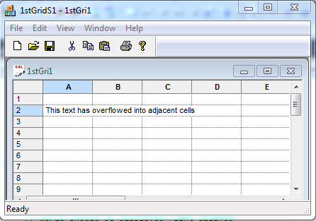
Floating cells have to be calculated depending on the size of the text in a cell. When you type text into a cell, the size of the text will always be calculated. In the case that the text does not fit into a cell, the cell will automatically be expanded (similar to Microsoft Excel).
Merged Cells
To enable cell merging, add the following line in OnInitialUpdate() or OnInitDialog():
SetMergeCellsMode(nMode);
nMode can be one of:
• gxnMergeDisable - Disable merge cells.
• gxnMergeDelayEval - Delay evaluation of merge cells.
• gxnMergeEvalOnDisplay - Always reevaluate merge cells before they are displayed.
nMode may be combined with any of the following optional flags:
• gxnMergeHorzOnly - Cells can only be merged horizontally.
• gxnMergeVertOnly - Cells can only be merged vertically.
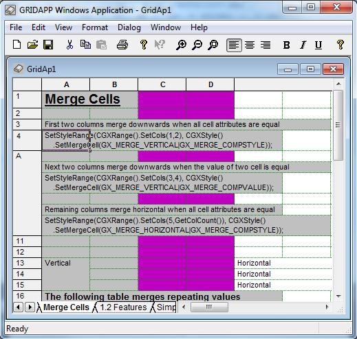
What Are Merged Cells?
Merged cells are cells that automatically join neighboring cells when both cells have the same value or style settings.
A very popular use for merge cells is the display of cross tables or other reports where the information is grouped by different categories.
For example, if you have a report like:
Year Month Value
1997 Jan 5
1997 Feb 4
1997 Mar 4
1997 Apr 2
1997 Jun 8
....
with merge cells, the year will only be displayed as one big cell and not repeated for every row.
Registration and Usage of Base Styles
The CGXStylesMap class maintains grid-wide styles that make it possible to group specific kinds of cells and make them have similar attributes. The predefined base styles are: row-header-style, column-header-style, and standard-style. Row header cells inherit their attributes from row-header-style. Column headers inherit their attributes from column-header-style. Standard-style is the base style for all cells in the grid.
You can modify these predefined base styles by calling the CGXGridCore member functions ChangeStandardStyle(), ChangeRowHeaderStyle(), and ChangeColHeaderStyle() to change their state.
// change the standard style. This changes the default settings
// for all cells in the grid.
ChangeStandardStyle(CGXStyle()
.SetFont(CGXFont().SetFaceName("Courier").SetSize(10))
.SetWrapText(FALSE));
If you want to extend the grid with additional base styles, you need to register them in the CGXStylesMap object.
The following example shows you how to:
1. Register a base style.
2. Change the base style with the BaseStyle() method.
3. Apply the base style to cells.
The base style settings can be loaded from or written to the My base styles profile/registry section.
class CMyGrid: public CGXGridView
{
...
// Attributes
public:
WORD m_wStyleError;
...
};
void CMyGrid::OnInitialUpdate()
{
// Attach parameter object to the grid
SetParam(&GetDocument()->m_param, FALSE);
// check for existence of stylesmap object
if (GetParam()->GetStylesMap() == NULL)
{
// Create one
CGXStylesMap* stylesmap = new CGXStylesMap;
// standard styles
stylesmap->CreateStandardStyles();
// Register additional base styles
stylesmap->RegisterStyle(szErrorStyle,
CGXStyle()
.SetTextColor(RGB(255,255,0)) // yellow
.SetInterior(RGB(255,0,0)) // red
.SetFont(CGXFont()
.SetBold(TRUE)
),
TRUE // system-style (non removable)
);
// load profile/registry settings
stylesmap->SetSection("My base styles");
stylesmap->ReadProfile();
// attach styles-map object to parameter-object
GetParam()->SetStylesMap(stylesmap);
}
CGXGridView::OnInitialUpdate();
// determine the identifiers for the base styles
m_wStyleError = GetParam()->GetStylesMap()->
GetBaseStyleId(szErrorStyle);
// Now you can use this identifier to change the style
// e.g.
BaseStyle(m_wStyleCombo)
.SetChoiceList("one\ntwo\nthree");
// where BaseStyle(id) is a member function
// of CGXGridCore which returns a
// reference to the specified base-style.
//
// - Or -
//
// you can to apply this base-style to cells
// e.g.
SetStyleRange(CGXRange(5,2,8,3),
CGXStyle()
.SetBaseStyle(m_wStyleError)
);
}
You can also apply base style to cells at run time (depending on the context of the cell) by overriding the GetStyleRowCol() method. The following example assigns the Error Style to the cell if the cell's value is negative. The appearance of the Error Style can be modified by the end user with the pre-built CGXStylesDialog dialog.
BOOL CMyGrid::GetStyleRowCol(ROWCOL nRow, ROWCOL nCol,
CGXStyle& style, GXModifyType mt,
int nType)
{
if (CGXGridView::GetStyleRowCol(nRow, nCol,
style, mt, nType))
{
if (mt == gxRemove || nType == -1)
return TRUE;
if (style.GetIncludeValue() &&
style.GetDoubleValue() < 0)
{
// Negative value should be outlined
// with "Error Style"
style.SetBaseStyle(m_wErrorStyle);
}
return TRUE;
}
return FALSE;
}
Registration and Usage of User Attributes
You can store binary information into any CGXStyle object by using a derived CGXAbstractUserAttribute object. This technique is much more convenient than using SetItemDataPtr(), because you don't have to worry about deleting objects.
Objective Grid offers a default CGXUserAttribute class that provides support for numbers and strings. Using CGXUserAttribute decreases the memory usage of user attributes. Numbers will only be stored as doubles and no string needs to be allocated. If you pass a string to CGXStyle::SetUserAttribute(), the value will be parsed, and if it is a plain number, it will be stored as a double.
In addition, user attributes increase the flexibility of the styles architecture. It is much easier now to add user attributes than to subclass CGXStyle to add built-in attributes. CGXAbstractUserAttribute comes with full support for serialization and reading and writing to the profile or registry. User attributes can also be modified by the user via the CGXUserAttributePage.
If you want to create a user attribute class for your own binary objects, you have to override Clone(). This method is called in order to copy your binary object from one style object to another.
// Copying attribute (e.g. from one style object to another)
CGXAbstractUserAttribute* CGXUserAttribute::Clone() const
{
return new CGXUserAttribute(*this);
}
If you want to add support for OLE Drag & Drop, cutting to and pasting from the clipboard, and Serialization you should also override Serialize().
void CGXAbstractUserAttribute::Serialize(CArchive& ar)
{
if (ar.IsStoring())
ar << GetValue();
else
{
CString s;
ar >> s;
SetValue(s);
}
}
If you want to add support for the user attribute page in the grid object and/or registry, you should also override the GetValue() and SetValue() methods. They convert your binary object into a string and back. See the Objective Grid Class Reference for CGXAbstractUserAttribute if you want to do this. There are additional overrides that allow you to fine-tune your derived user attribute. For example, IsEqual() and IsEmpty().
To control the behavior of text that is too long to be easily visible in a cell, you can set an ellipsis (“...”) using the attribute CGXEllipseUserAttribute with GX_IDS_UA_ELLIPSISTYPE.
For example, the following code sets a dotted ellipsis:
SetStyleRange(CGXRange().SetRows(5,GetRowCount()),
CGXStyle().SetUserAttributePtr(GX_IDS_UA_ELLIPSISTYPE,
new CGXEllipseUserAttribute(gxDotEllipse)));
Three possible options are available:
gxNoEllipse No ellipsis, the default.
gxDotEllipse Dotted ellipsis (“...”)
gxPoundEllipse Pound ellipsis (“####”)
Note: Inserting an ellipsis at the beginning of text, i.e. “...text” is not supported.
Creating Custom Attributes
The CGXStylesMap class maintains a list of user attributes. If you want to extend the CGXStyle class with user defined attributes, you need to register them in the CGXStylesMap object.
To register user defined attributes, follow these steps:
1. Create a string resource (e.g. IDS_MY_USERATTR) using Visual Studio Resource View by opening the string table in the resource file and adding your custom string resource. Your .RC - file will change accordingly:
STRINGTABLE DISCARDABLE
BEGIN
IDS_UA_MYUSERATTR "My user attribute"
END
// "My user attribute" will be displayed in the
// "User"-page of the pre-built CGXStyleSheet dialog.
2. Call AddUserAttribute() with the resource ID and a style. This style is used for displaying the attribute's value in the User-defined attributes grid in the CGXStyleSheet dialog. Each user-defined attribute is displayed as a row with the name and the attribute’s value. The end user can change the value through the CGXStyleSheet dialog. This step is not necessary if you do not want the user attribute exposed to the end user via the CGXStyleSheet dialog.
void CMyGrid::OnInitialUpdate()
{
// Attach parameter object to the grid
SetParam(&GetDocument()->m_param, FALSE);
// check for existence of stylesmap object
if (GetParam()->GetStylesMap() == NULL)
{
// Create one
CGXStylesMap* stylesmap = new CGXStylesMap;
// standard styles
stylesmap->CreateStandardStyles();
// Additional base styles
...
// user attributes
// style for the cell in "User"-page
// (user should be able to increase/decrease the value
// with a spin control).
CGXStyle styleSpin;
styleSpin
.SetControl(GX_IDS_CTRL_SPINEDIT)
.SetWrapText(FALSE);
// "My user attribute"
stylesmap->AddUserAttribute(IDS_UA_MYUSERATTR,
CGXStyle().SetWrapText(TRUE).SetAutoSize(TRUE));
// load profile/registry settings
stylesmap->SetSection("My base styles");
stylesmap->ReadProfile();
// attach object to parameter-object
GetParam()->SetStylesMap(stylesmap);
}
}
3. A control can now interpret this attribute.
void CMyControl::OnClickedButton(CGXChild* pChild)
{
NeedStyle();
CString sValue = m_pStyle->
GetUserAttribute(IDS_UA_MYUSERATTR);
AfxMessageBox("My user attribute = " + sValue);
CGXControl::OnClickedButton(pChild);
}
4. And you can use the user attribute with your cells:
SetStyleRange(CGXRange(1,1),
CGXStyle()
.SetControl(IDS_CTRL_MYCONTROL);
.SetUserAttribute(IDS_UA_MYUSERATTR, "20");
SetStyleRange(CGXRange(1,2),
CGXStyle()
.SetControl(IDS_CTRL_MYCONTROL);
.SetUserAttribute(IDS_UA_MYUSERATTR, "40");