Custom Status Bar
Objective Toolkit’s custom status bar class, SECCustomStatusBar, is a Windows status bar that has more features and is easier to configure than MFC’s CStatusBar. The custom status bar allows you to configure the fonts used in status bar panes, the text alignment, and foreground and background colors. When you use CStatusBar, panes can only contain text. The custom status bar adds the ability to embed bitmaps in status bar panes. Moreover, the custom status bar allows you to assign custom cursor bitmaps to individual status bar panes. When the cursor is inside the pane, the cursor takes the form of the specified bitmap. Outside of the pane, the cursor returns to its normal shape. In addition, the custom status bar helps process mouse events inside a status bar pane.
In addition, the custom status bar incorporates a progress indicator that you can show programmatically in place of the status bar panes and then hide when the process finishes.
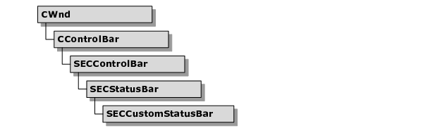
SECCustomStatusBar inherits all the functionality of a standard MFC status bar and adds the features described previously.
Using SECCustomStatusBar
The following sections describe how to use the custom status bar and its associated progress bar in your application.
To incorporate SECCustomStatusBar into your code
The following steps assume that you have created an application that already has an initial status bar based on CStatusBar or SECStatusBar.
1. Replace the class for your frame window’s status bar (CStatusBar or SECStatusBar) with SECCustomStatusBar.
a. For each pane you want to add to the status bar, create a resource symbol for the new status bar pane (for example, ID_INDICATOR_EDIT).
2. Add the new resource symbols as elements in the indicators array. This array is usually declared with module scope in the implementation file for your frame class. It specifies the positions of each pane in the status bar.
static UINT indicators[]=
{
ID_SEPARATOR,
ID_INDICATOR_EDIT, // added here!
ID_INDICATOR_CAPS,
ID_INDICATOR_NUM,
ID_INDICATOR_SCRL;
};
3. Ensure that the indicators array is passed in to SECCustomStatusBar::SetIndicators().
if (!m_wndStatusBar.Create(this) ||
!m_wndStatusBar.SetIndicators(indicators,
sizeof(indicators)/sizeof(UINT)))
{
TRACE0("Failed to create status bar\n");
return -1; // fail to create
}
4. After the status bar has been created via Create() and initialized via SetIndicators(), create the status bar panes. Status bar panes can contain bitmaps, text, or CWnd-based controls.
To add bitmap or text panes, create a PANEINFOEX structure, set the appropriate data fields in the structure, and call SetPaneInfoEx().
...
// Configure a text pane.
PANEINFOEX pex;
pex.iIndex = 2;
pex.strText = “Text”;
pex.iFlags = SBP_TEXT;
m_wndStatusBar.SetPaneInfoEx(&pex);
// Configure a text pane.
pex.iIndex = 3;
pex.pBitmap = m_pBitmap;
pex.iFlags = SBP_BITMAP;
m_wndStatusBar.SetPaneInfoEx(&pex);
...
NOTE >> The SBP_BITMAP and SBP_TEXT style flags shown above are mutually exclusive.
To add CWnd-derived controls, create the controls and then register them with the status bar via the RegisterWndToPane() member. The CommandToIndex() member fetches the correct index parameter.
For example, the following code adds an edit control to the status bar:
...
int nPanelIndex=m_wndStatusBar.CommandToIndex(
ID_INDICATOR_EDIT);
m_wndPanelEdit.Create(WS_VISIBLE|ES_LEFT|
ES_AUTOHSCROLL,
CRect(0,0,0,0),
&m_wndStatusBar,
ID_INDICATOR_EDIT);
m_wndStatusBar.RegisterWndToPane(
nPanelIndex, &m_wndPanelEdit,
SECCustomStatusBar::FitPaneToWnd);
...
You’re done. The CWnd object is now automatically sized and positioned in response to SECCustomStatusBar events. Call RegisterWndToPane() with a NULL CWnd* to unregister a window.
The sample
\Samples\Toolkit\MFC\UIExt\statbar sampledemonstrates how to use the
SECCustomStatusBar class. This sample is not shipped with the product. For information on how to obtain this sample, see
“Location of Sample Code” in the
Getting Started part.
To display the progress bar over the status bar
SECCustomStatusBar includes routines that allow the application to replace the status bar with a progress control bar temporarily. The progress control bar is implemented as an SECProgressCtrl object so you can use the extended styles provided by SECProgressCtrl. In addition, you can display a text string to the left of the progress bar.
1. Use the InitializeProgressControl() method to create and display the progress bar. This function sets the optional text, the range and initial value of the progress indicator, and the extended style flags.
2. Call SetProgress() or StepProgress() to update the progress indicator.
3. Call SetPaneText() for pane 0 to change the text to the left of the bar.
4. Call UninitializeProgressControl() to remove the progress bar.
SECCustomStatusBar does not support the SEC_EX_PROGRESS_SHOWTEXT style for the progress bar. Nor does it provide a method for setting the text string, and the m_pProgressCtrl member is protected. To use the SEC_EX_PROGRESS_SHOWTEXT style, create a new class derived from SECCustomStatusBar. You might add a new function to your class that passes the text along to the progress bar.
For example:
MyCustomStatusBar::SetProgressBarText(LPCTSTR pString)
{
m_pProgressCtrl->SetWindowText(pString);
}
Then you can call SetProgressBarText() to update the text whenever you call SetProgress() or StepProgress() to update the progress indicator.
Customizing SECCustomStatusBar
The following section describes how to modify the behavior or appearance of the custom status bar.
To customize panes with the PANEINFOEX structure
The SECCustomStatusBar class adds several configurable attributes to your frame window’s status bar. PANEINFOEX is a structure that aggregates every attribute of one pane of a custom status bar. The PANEINFOEX structure aggregates every attribute introduced by SECCustomStatusBar. It even includes attributes defined by its base class, SECStatusBar.
The following code shows how to set flags for each attribute you want to apply to a status bar pane.
// Configure the second pane to display
// the light bitmap and
// use the gripping hand cursor.
PANEINFOEX pex;
pex.iIndex = 2;
pex.hCursor =
AfxGetApp()->LoadCursor(IDC_GRIPPING_HAND);
pex.pBitmap = m_pBitmap;
pex.iFlags = SBP_CURSOR | SBP_BITMAP;
m_wndStatusBar.SetPaneInfoEx(&pex);
The flags for the iFlags member of PANEINFOEX can include the following:
SBP_ID | Set the ID of the pane to the uiID member of PANEINFOEX. |
SBP_STYLE | Set the style of the pane to that of the uiStyle member of PANEINFO. |
SBP_WIDTH | Use the cxWidth member of PANEINFO for the width. |
SBP_TEXT | Use the text set in the strText member of PANEINFO for the pane. |
SBP_TEXT_ALIGN | Use the iTextAlignment member of PANEINFO for text alignment. (Text alignment flags like TA_LEFT are defined in WINGDI.H.) |
SBP_FOREGROUND | Use the COLORREF set in the crTextForeground member of PANEINFOEX for the foreground color. |
SBP_BACKGROUND | Use the COLORREF set in the crTextBackground member of PANEINFOEX for the background color. |
SBP_BITMAP | Display the CBitmap pointed to by the pBitmap member of PANEINFOEX in the pane. |
SBP_CURSOR | Display the cursor specified by the hCursor member of PANEINFOEX when the mouse pointer is over the pane. |
These flags can be logically OR’d together. However, the following flags are mutually exclusive: SBP_BITMAP, SBP_TEXT, and SBP_STYLE.
To extend the SECCustomStatusBar class
The SECCustomStatusBar class has the following virtual member functions that allow you to customize the behavior of the class.
Table 40 – Virtual Member Functions for SECCustomStatusBar
Method | Description |
InitializeProgressControl() | Initializes and shows the progress indicator. |
UninitializeProgressControl() | Deletes the progress indicator and restores the status bar to its original content. |
SetVisibleAllRegWnd() | Sets the visibility of the registered windows. |
ResizeAllRegWnd() | Resizes all registered windows based on current attributes. |
