Labels
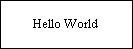
Text can be added to the canvas by pressing the Text toolbar button and then clicking the left mouse button on the canvas. The text is added to the canvas at the mouse pointer location when the mouse is clicked. The added text contains a default string that can be configured by your application.
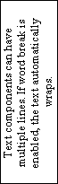
Text components are similar to rectangle components. A rectangular box is drawn around the border of the text component using the line properties. If the line property is set to transparent, no border is drawn. The text component can be moved, scaled, and rotated. The four vertices that comprise the bounding rectangle of the text component can be edited. Like the rectangle component, the text component maintains its shape when a vertex is moved.
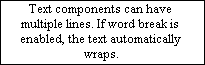
The text component can be configured to support either a single line or multiple lines of text. If the multi-line text is enabled, the automatic word break (word wrap) feature can be enabled or disabled. Both of these features are implemented as properties that can be configured through the Text property page.
The text can also be aligned vertically or horizontally. Vertical alignment is only applicable to single line text. The alignment properties can be configured through the Text property page.