Property Pages
You can associate any component with a number of properties. To determine what properties are associated with a component, you need to open the component property sheet. To access this property sheet, select one or more components and then choose the Properties command from the View menu. You can also right-click over a component and choose Properties from the shortcut (context) menu to view a property sheet for the selected component.
The component property sheet is a tabbed dialog box that displays the properties you can edit. The pages available on the property sheet depend on the type of component selected. The remainder of this section explains how to use each property page.
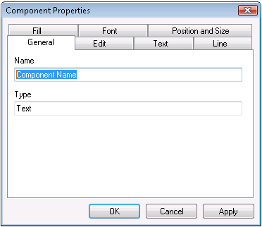
General Properties
This property page shows information such as the name and type of the component. The properties displayed here depend on the type of the component.
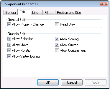
Edit Properties
On this page, you can define what actions a user can perform on a component. For instance, you can forbid stretching a component out of proportion.
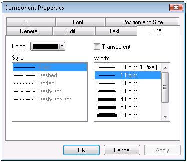
Line Properties
These properties define how the lines appear in the component. You can set color, style and width.
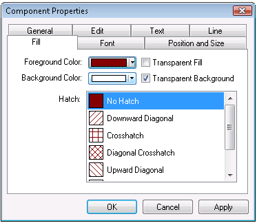
Fill Properties
These properties define how a component is filled. The most commonly used fill is a solid fill, which is a foreground color with no hatching. You can also choose a hatched fill pattern with a background color.
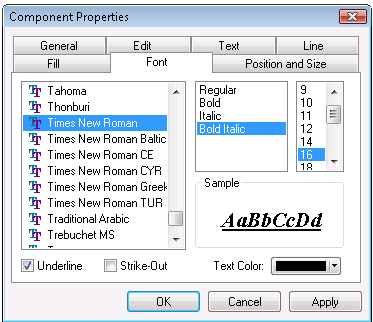
Font Properties
These properties define how the text appears in a component. You can choose any True Type font and then apply any typographical effects such as italic or underline. Only True Type fonts are available because True Type fonts are the only fonts that support rotation.
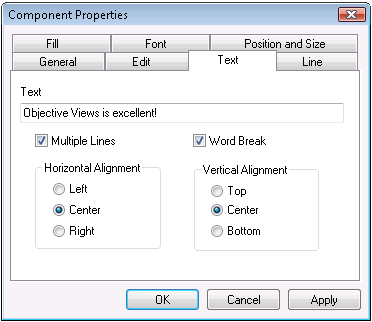
Text Properties
The text property page allows you to determine how the text is displayed and edited. You can use a checkbox to toggle between single line and multiple line text. If multi-line text is enabled, the Word Break checkbox allows you to toggle automatic word break on and off. Horizontal alignment can be set to left, center, or right. Vertical alignment can be set to top, center, or bottom.
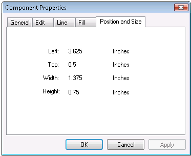
Position and Size
This property page displays the position and size of the given component. It is only shown when a single component is selected. The position and size is shown using the current unit of measure set for the canvas.