Air Quality Example
This first example uses an ASCII file containing three columns of data. Each column contains 8,760 floating-point values.
This dataset contains atmospheric data collected by environmental monitoring instruments taken in one hour intervals for an entire year, which resulted in 8,760 observations of temperature, carbon monoxide, and sulphur dioxide levels. Using the Navigator, you can quickly analyze this data.
In this session, you will learn how to do the following:

Import ASCII data without elaborate conversion or programming.
Compute and display a mathematical relationship between entire datasets.
View your data using three different graphical methods: 2D line, image, and surface.
View cross-sectional plots of image data.
Experiment with different colortables.
Use the online help system.
Print your results.
Importing ASCII Data
Start by importing the atmospheric data for the example. The data file consists of three columns:
Column 1—Temperature (degrees Fahrenheit)
Column 2—CO (carbon monoxide)
Column 3—SO2 (sulphur dioxide)
1. Click the
WzPreview icon in the Navigator main window. (When you move the pointer over the icons, their names appear in the upper-left portion of the Navigator window, just above the leftmost icon.) The WzPreview Tool appears as shown in
Table C-2: WzPreview Tool on page 231.
2. Click MB1 in the Filename text field. This selects the field for receiving typed input.
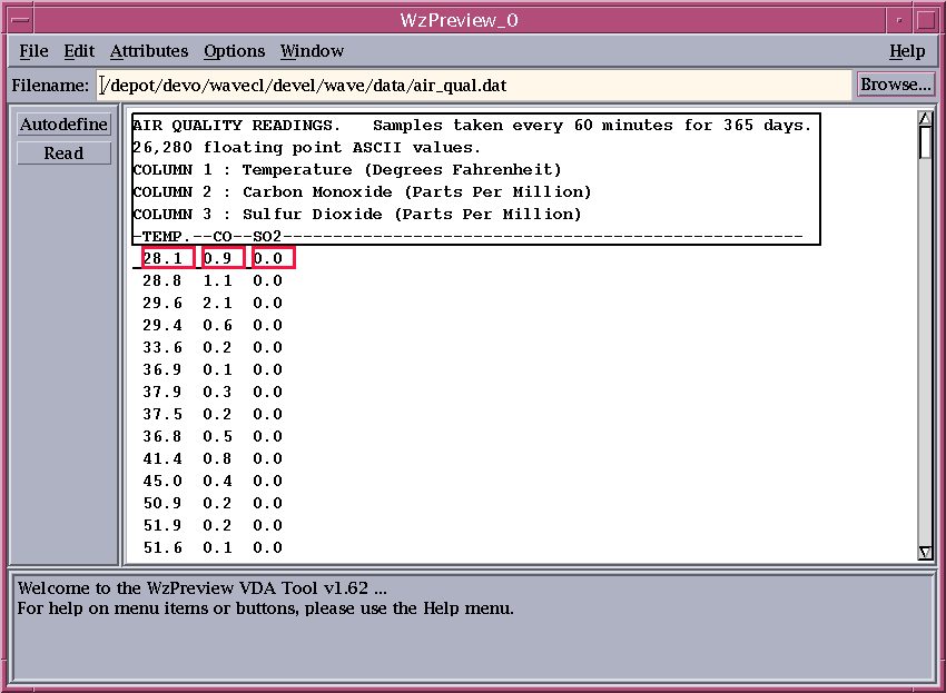
3. Type the full path and filename of the first example data file, as follows:
(UNIX) <RW_DIR>/wave/data/air_qual.dat
(WIN) <RW_DIR>\wave\data\air_qual.dat
where <RW_DIR> is the name of the directory where PV‑WAVE is installed. If you aren’t sure which directory this is, see your system administrator.
4. Press <Return>. In a few moments, the top of the
air_qual.dat file appears in the display area of the WzPreview Tool as shown in
Table C-3: WzPreview Tool with Highlighted Text on page 231. WzPreview has auto-defined and named the three columns of data it “sees” in the file. The width of each column is shown with a small rectangle, and the header information is differentiated from the data with a larger rectangle.
5. Click the Read button in the control area of the WzPreview Tool. This function reads the columns of the data file into individual variables.
The WzPreview Tool has enabled you to read the data without programming or converting it. Indeed, the WzPreview Tool understood enough to read past the header information in the data file.
note | Look in the message area—the rectangular text area along the bottom edge of the WzPreview Tool. A message informs you when the read operation is complete and tells you the names of the variables that have been created. |
Creating XY Plots
At this point, you have read ASCII data into variables with very little effort and with no programming at all.
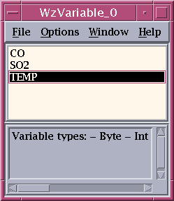
The next step is to plot this data. Before doing this, bring up another VDA Tool called WzVariable. Think of WzVariable as a data manager. Use this tool to list and select the variables that you want to plot during a session.
1. Click on the
WzVariable icon in the Navigator window. The WzVariable Tool appears as shown in
Table C-4: WzVariable Tool on page 233. All the variables you created with WzPreview are all listed in the WzVariable window.
2. To get a first graphical view of your data, select TEMP from the WzVariable list by clicking on it with MB1.
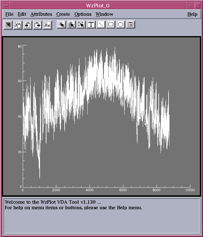
3. Click the
WzPlot icon in the Navigator window. A 2D line plot of the data appears in the WzPlot Tool as shown in
Table C-5: WzPlot Tool on page 233. Move the WzVariable Tool to another location on your screen if it is in the way, but do not close it yet.
WzPlot distributes the points evenly along the x-axis and plots their values along the y-axis. This example lets you see daily temperature variations at the observing station along with the annual variation. By looking for the place where the data drops nearly down to the bottom axis, you can spot a cold snap during the winter months.
At this point, you have meaningful graphic of the data without typing a single command.
Once you get a plot in the WzPlot Tool, you can modify it easily. Take a look at the menus available on the menu bar. Functions on the Attributes menu let you modify the appearance of the plot and the data. Functions on the Create menu let you add graphical elements such as lines and text to a graph. The button bar, just below the menu bar, contains functions for adding graphical elements, selecting data and graphics, and several editing functions.
We’ll explain more about these capabilities later.
4. Exit the WzPlot Tool by selecting File=>Close.
Using PV-WAVE Commands
The variables you have read in and plotted are normal PV‑WAVE variables. They “exist” in PV‑WAVE at the main program level. Therefore, you can perform operations on these variables from the command line using PV‑WAVE functions and procedures.
Next, you will perform some simple operations on the variables you have created. Then, you will see how the processed variables can again be displayed in the WzPlot Tool.
With PV‑WAVE, you can easily do mathematics on an entire array. Because of the way the numerical operators work in PV‑WAVE, you can handle entire datasets with a single equation. For example, suppose you want to plot each day’s ratio of SO2 concentration to its temperature.
1. To compute this ratio, enter the following command at the WAVE> prompt. (This prompt appears in the window from which you started PV‑WAVE. You might need to move other windows out of the way to see the WAVE> prompt window.)
WAVE> RATIO = SO2/TEMP
2. Display this newly created variable, RATIO, in the WzVariable Tool. To do this, select Options=>Redisplay List from the WzVariable Tool menu. The variable RATIO appears in the list.
3. Select RATIO by clicking MB1 on it.
4. Plot this variable the same way you plotted the TEMP variable previously. Simply click the WzPlot icon in the Navigator window.
5. When you have finished viewing this data, close the WzPlot Tool.
Reformatting Datasets
You can reorganize data to analyze periodicity. The temperature dataset you are working with has two periods:
Diurnal—A period equal to 24 hours
Annual—A period equal to 365 days
You can derive some interesting graphics by converting the 8,760-point, 1D TEMP variable into a 24-by-365 2D variable. In the new variable, the first dimension now represents the hour of the day and the second dimension represents the day of the year.
1. Convert your data by entering the following at the WAVE> prompt:
WAVE> TEMP_I = REFORM(TEMP, 24, 365)
2. Display this newly created variable, TEMP_I, in the WzVariable Tool. To do this, select Options=>Redisplay List from the WzVariable Tool menu. The variable TEMP_I appears in the WzVariable list box.
3. Verify that this is a 2D (24-by-365) variable by double clicking on the variable name in the WzVariable Tool.
4. Click OK in the Variable Information dialog box to dismiss it.
Now you can look at this new 2D variable in some new ways. You’ll use image processing techniques with this time-series data.
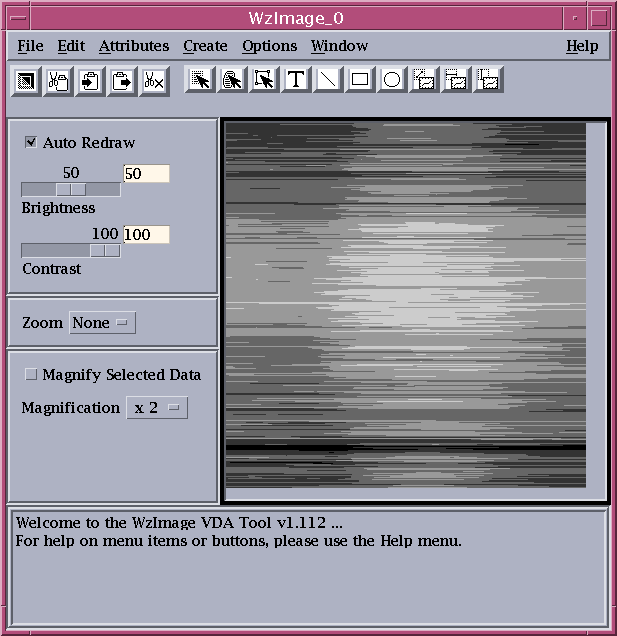
Displaying Data as an Image
Viewing data as an image is a powerful technique for looking at a large amount of data at once, because an image is compact and it enables you to use color to differentiate the various values in the dataset.
1. If the TEMP_I variable is not already selected in the WzVariable Tool list, select it. Make sure all other variables are deselected.
2. Click on the WzImage icon in the Navigator window. PV‑WAVE displays an image of this 2D variable. Remember that in a WzImage view, each data value is represented by only one pixel.
Using Color
PV‑WAVE supplies you with a number of colortables that display values in color rather than shades of gray.
1. To try color, select the WzColorEdit icon from the Navigator window.
2. If necessary, move the WzColorEdit Tool away from WzImage Tool, so that you can see the image.
3. Select ColorTable=>System to display the list of System Colortables.
4. Click on the Blue-Red item in the list and notice the change. Click Dismiss when you are finished with the list of System Colortables.
The image now appears in colors better suited for the display of this temperature data. If you like, you can try some of the other system colortables available to you.
5. Close the WzColorEdit Tool by selecting File=>Close when you are done experimenting with colors.
6. Close the WzImage Tool.
Resizing the Image
You can resize the image to make it larger and easier to view. You do this by adding additional values to the dataset.
The image displayed is long and narrow. To increase the size in the horizontal direction, you can increase the number of points in the array.
PV‑WAVE provides several functions to help. Two functions, CONGRID and REBIN, will do the job. CONGRID interpolates a new set of points with the same overall shape as the old set. REBIN produces a similar result, faster than CONGRID, but requires that the new set be a factor or multiple of the old set.
Go ahead and use REBIN to increase the horizontal dimension by some multiple to get a larger number of points. The number 360 is a multiple of 24. Change the first dimension of 24 points to 360 (24 times 15) and leave the second at its original 365.
1. Enter the following command at the WAVE> prompt:
WAVE> TEMP_I = REBIN(TEMP_I, 24*15, 365)
PV‑WAVE will evaluate the mathematical expression given as the second parameter, resulting in a first dimension of 360.
2. Now, just click the Redraw button on the WzImage Tool button bar. The image is updated when you click Redraw because the variable you updated is the same one that is currently displayed in the VDA Tool. In this case, there was no reason to use the WzVariable Tool.
3. Resize the WzImage window so that the entire image is displayed. Do this by pressing MB1 over the lower right corner of the border and dragging.
WzImage automatically scales the numerical values of the dataset so that every shade of color (or every shade of gray) is utilized. The lightest points have a numerical value of 127, while the darkest have a value of 0 (zero).
The origin of the image is at the lower left; thus, the beginning of the year is at the bottom, and the beginning of each day is at the left.
As you would expect, the temperature is at its minimum (the darkest colors) near the beginning of each day and at its maximum (the lightest colors) near the middle of each day. It’s also easy to see that the average daily temperature reaches its minimum early in the year and its maximum in the middle of the year.
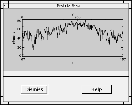
Displaying Profile Plots
You can easily create profile plots. With the data you are using in this tutorial, a row profile plot represents temperature variations during a day. A column profile plot represents the temperature for each day of the year, measured at the same time each day. The profile, which is like a cross-section of the image, allows you to examine a particular portion of the image with more precision than you can in the image itself.
1. Select either the Row Profile button or the Column Profile button from the button bar (just below the menu bar on the WzImage Tool), or select Column Profile or Row Profile from the Edit menu to start a row or column plot. A blank viewing mode window appears, ready to display the row or column that you select.
2. Using MB1, click the image at the point where you want to see a cross-section. Clicking MB1 displays either a row or column plot, depending on which profile button you chose. Remember that the plots are scaled to fit the available viewing area.
3. Press and drag MB1 and the profile is updated dynamically.
4. When you are through looking at profiles, click the Dismiss button in the Profile window.
note | The VDA Tool stays in the profiling mode until you select a different mode such as data selection or object selection. |
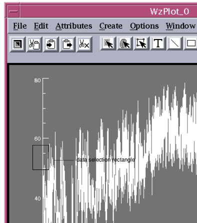
Manipulating Data Across VDA Tools
This example demonstrates how VDA Tools can share the same data. When you modify the data in one VDA Tool, the changes take effect for all VDA Tools sharing the same data.
1. First, in the WzVariable List, select the variable TEMP.
2. Now, click the WzPlot icon in the Navigator window. This brings up the same 2D plot you saw previously.
Remember the dip that occurs early in the sampling period, which we attributed to a cold snap? Let’s assume that there wasn’t a cold snap, but rather the data sampled during that period was erroneous.
Let’s correct the faulty data using the data selection feature and the WzTable Tool.
3. Click the WzTable icon in the Navigator window. WzTable opens and the individual data values from the TEMP variable are shown in the table cells.
4. Move the windows so that you can see both the WzTable Tool and WzPlot Tool at once.
5. In the WzPlot Tool, select Edit=>Data Select. This puts the Tool in data selection mode.
6. Select the downward spike that we previously attributed to a cold snap. To do this, press and drag MB1 to draw a rectangle around the data. Try to select the entire spike, approximately as shown in
Table C-8: Selected Area on 2D Plot on page 240.
Notice that the selected data is highlighted in both the WzPlot Tool and the WzTable Tool. Use the scroll bars in the WzTable Tool to scroll through the range of selected data values.
7. Now, edit the variable TEMP directly by entering 32 in the Change Selected Values To field of the WzTable Tool.
8. Press <Return>. The plot in WzPlot is automatically updated with the new values. Note that this operation has directly modified the variable TEMP. You could have edited each value in the table individually instead of setting them all to one value.
9. See what happens when you select Edit=>Undo from the WzTable menu bar. We encourage you to experiment with other values and other selected ranges of data.
10. Close the WzPlot and WzTable windows.
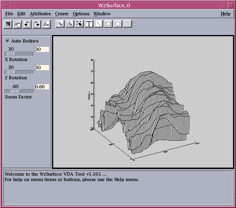
Creating Three-Dimensional Surface Plots
You can display the data as a mesh surface plot.
1. If the TEMP_I variable is not already selected in the WzVariable Tool list, select it. Make sure all other variables are deselected.
2. Click on the
WzSurface icon in the Navigator window. The WzSurface Tool appears as shown in
WzSurface Tool.
Using Online Help
Use online help anytime you want more detailed information about a particular Navigator feature. Online help also gives you fast access to reference information on all PV‑WAVE functions and procedures and features of the programming language.
We encourage you to experiment with the help system as you progress through this tutorial.
PV-WAVE Online Help
First, let’s see what information is available on the REBIN command that you used during this lesson. REBIN is a PV‑WAVE function.
1. At the WAVE> prompt, type:
WAVE> HELP, ’REBIN’
After a few moments, the online help system starts and reference information on the REBIN function is displayed in the help window.
2. Type the following command at the WAVE> prompt:
WAVE> HELP, ’REFORM’
Reference information on REFORM is displayed in the help window.
note | If you want to learn more about the online help system, select Help=>On Help from the menu bar of any VDA Tool or the Navigator. |
Context-Sensitive Help
When you are using the Navigator or VDA Tools, context-sensitive help is available to you at any time during the session. Context-sensitive help is available when you select Help=>On Window from the Navigator menu or from any VDA Tool menu. On Window displays a table of contents of information about the specific window.
1. Select Help=>On Window from the WzSurface Tool menu bar.
In addition, all dialog boxes have a Help button that brings up specific reference information about that dialog box.
note | You can leave the help window open, and refer to it at any time. |
2. Select Attributes=>Surface Attributes from the WzSurface Tool menu bar. The Surface Attributes dialog box appears.
3. Click the Help button in the dialog box. Information on the dialog box is displayed in the help window.
4. Click the Cancel button to close the Surface Attributes dialog box.
Printing Your Results
Obtaining a printed version of a VDA Tool window is often an important step, because it enables you to share your results with others. But if you do not wish to create a hardcopy version of the surface you see in the VDA Tool, you may skip this section.
1. To print a copy of the plot that you see in the WzSurface Tool, select File=>Print. The Printer Setup dialog box appears.
2. Type the appropriate print queue name in the text field. If you do not know the print queue name, ask your System Administrator, or just leave the text field empty to try the default queue.
3. Select the appropriate output format for your printer from the Printer Type option menu.
4. Select the Print button.
5. Click OK to dismiss the dialog box. (If you type the wrong print queue, or wish to change the print queue, you need to select File=>Print Setup to display the Printer Setup dialog box again.)
note | On UNIX or Windows: If you wish to print subsequent graphics during this session, you can simply select File=>Print. This is because you only have to set up your printer options once during a session. The Printer Setup dialog box will not appear again unless you explicitly select File=>Print Setup. |
6. Close the WzSurface Tool by selecting File=>Close.
7. Also close the WzVariable Tool.
Printing procedures will vary from site to site. If you have difficulty printing, contact your System Administrator to determine the proper printer queue names, output formats, and printer options.
Experimenting on Your Own
In this example, you have done some simple visual data analysis, mostly of temperature data. You may want to continue working with this data to explore the relationship of temperature to the recorded levels of CO and SO2 and we encourage you to do so.
In this session, you have learned how to do the following:
Import ASCII data without elaborate conversion or programming.
Compute and display a mathematical relationship between entire datasets.
View your data using three different graphical methods: 2D line, image, and surface.
View cross-sectional plots of image data.
Experiment with different colortables.
Use the online help system.
Print your results.
If you have an ASCII dataset of your own that would lend itself to similar visual data analysis, try it.
Ending the Session
You can exit the Navigator and PV‑WAVE session or continue to the next tutorial.
When you exit the Navigator, all of the data you have imported or created through processing remains on the main program level of PV‑WAVE. When you exit PV‑WAVE, however, all the data you have imported or created will be lost unless you have saved it.
Of course, the original data in the imported file remains intact.
To exit the Navigator, choose
File=>Close from
the Navigator window. To exit from PV‑WAVE altogether, type
EXIT at the
WAVE> prompt.
note | We’ll discuss saving files in a later example, so don’t bother to save your data now. You won’t need the results from this example for any future session. |
Version 2017.1
Copyright © 2019, Rogue Wave Software, Inc. All Rights Reserved.