Creating and Customizing Maps
This section explains how to create maps in PV‑WAVE using the MAP procedure and its keywords. In addition, procedures for annotating maps, creating map overlays, and combining maps and images are discussed.
Plotting a World Map
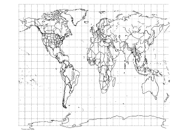
The MAP procedure, by default, displays a world coastline map taken from the World Databank II dataset.
For example, the following MAP call produces the map shown in
Equidistant Cylindrical Projection.
TEK_COLOR
MAP, Range = [-180, -90, 180, 90], $
Select = {,GROUP:['cil','bdy','pby', 'riv']}, Color = -1, $
/Gridlines, Gridstyle = 1, Gridcolor = 15
In this example, keywords are used to specify the range of data, select the map features to plot, create longitude/latitude gridlines, and add color. MAP accepts some additional optional keywords. Some of the keywords are discussed in the following sections. For a complete list and description of the keywords, see the description of MAP in the PV‑WAVE Reference.
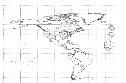
The Data keyword is used to specify the map dataset to plot. The World Databank II dataset (the default) and the USGS Digital Line Graph Dataset are provided with PV‑WAVE. You can also write custom procedures to read other map datasets. For example:
; Plot a U.S. map using data from the USGS Digital Line
; Graph Dataset. The Range keyword is used to specify the
; map region in longitude/latitude coordinates.
MAP, Data = 'usgs_db', Range = $
[-125, 25,-70,55], /Gridlines, /Axes, Gridstyle = 2
; Plot a map using data from a dataset that you have supplied and
; for which a custom read procedure has been written.
MAP, Data = 'mydbase'
note | By default, MAP plots vector data. That is, it works like the PLOT command and uses some of the same keywords as PLOT. If you specify the Filled keyword to MAP, then MAP works like POLYFILL and uses some of the same keywords as POLYFILL. The MAP procedure can only produce a “filled” map if the dataset it reads provides polygon data. Note that the World Databank II dataset does not provide polygon data, but the USGS Digital Line Graph Dataset does. |
Specifying a Map Projection
The Projection keyword for the MAP procedure lets you specify a projection for the map that is drawn. PV‑WAVE provides several built-in projections, but you can also add your own projection algorithm.
For example:
; Create a Cylindrical Mercator projection using the
; World Databank II data.
MAP, Projection = 3
; Use projection algorithm supplied by user. The projection name,
; “myprojection”, is the name of a PV‑WAVE routine in which the
; projection is defined.
MAP, User = 'myprojection'
For information on adding your own projection algorithm to PV‑WAVE, see
"Defining Your Own Projections".
To specify a projection, set the
Projection keyword to the corresponding map projection index number. The map projections and their index numbers are shown in
Table 12-1: Map Projections in PV‑WAVE on page 315.
Subsetting the Map Dataset
This section discusses the
Select,
Range,
Zoom,
Center, and
Resolution keywords. These MAP keywords are used to subset the map dataset in different ways. For more information on subsetting, see
"How to Optimize Your Mapping Application".
Selecting Map Attributes
Use the MAP Select keyword to specify the type(s) of map data (attributes) to plot.
To use the Select keyword, you need to know the special attributes (e.g., cities, political boundaries, rivers, continents) that are defined in the dataset. For example, the World Databank II includes coastlines, international boundaries, state boundaries, and rivers.
The following MAP command uses the Select keyword to specify that “CIL” (coastline, island, and lake) and “RIV” (river) data be plotted.
MAP, SELECT = {, GROUP: ['CIL', 'RIV']}
note | The Select keyword takes an unnamed structure as its input. For information on unnamed structures, refer to the PV‑WAVE Programmer’s Guide. |
Specifying the Map Limits
There are two ways to specify the portion of a map dataset to display. You can use the Range keyword or the Zoom and Center keywords.
Range Keyword
To use the Range keyword, you need to know the extent of the map data (its range in longitude and latitude). The World Databank II dataset, for example, is global in extent.
The Range keyword specifies the range of longitude and latitude values to be displayed. Range requires a four-element array containing the minimum longitude, minimum latitude, maximum longitude, and maximum latitude values to be plotted.
For example, the following MAP command uses the World Databank II data and plots the world map from between –90 and 90 degrees longitude and between –45 and 45 degrees latitude.
MAP, RANGE = [-90, -45, 90, 45]
Zoom and Center
For some applications the Zoom and Center keywords might be more convenient to use than the Range keyword to specify map limits.
To “zoom” in on a point on a map, use the Zoom and Center keywords. Center specifies a two-element array containing the longitude and latitude of the point to zoom in on. The Zoom keyword specifies a “zoom factor”. A zoom factor of 1 (the default) plots the entire globe. A zoom factor of 2 plots one-half of the globe, and so on.
MAP, Center = [-90, 30], Zoom = 2, /Gridlines, Gridstyle = 1
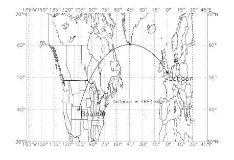
Plotting Great Circles, Straight Lines, and Text
Use the MAP_PLOTS procedure to draw either great circles or arbitrary straight lines on a map. MAP_PLOTS can also be used to compute geographical distances. To annotate a map, use the MAP_XYOUTS procedure.
Drawing Great Circles
A great circle is the intersection between a plane passing through the center of a sphere and the surface of a sphere. On a map, great circle lines represent the shortest distance between two geographical points. On most projections, great circles appear as curved lines.
By default, MAP_PLOTS computes the great circle between two points on a map projection and draws the great circle line.
Drawing Arbitrary Straight Lines
Use MAP_PLOTS with the NoCircle keyword to draw straight lines between two points on a map. Straight lines can be used to highlight or draw attention to a particular feature. The lines drawn are not great circle lines.
Calculating Distances
The Distance keyword to MAP_PLOTS returns in a named variable the actual distance in miles or kilometers between points. If two points are plotted, the distance is returned as a scalar; if multiple points are plotted, then an array of distance values is returned.
Adding Text to Maps
The MAP_XYOUTS procedure lets you position text on a map at specified longitude and latitude coordinates. This routine takes as parameters a point, specified as a longitude and latitude coordinate, and a text string. Keywords let you modify the text size, thickness, color, and alignment.
Example
The following example uses MAP, MAP_PLOTS and MAP_XYOUTS to plot a great circle between two cities (Boulder, Colorado and London, England) and label the cities. The distance between the cities is also calculated and placed into a text label. (The map produced by this code is shown in
Figure 12-4: Map Projection with Great Circle Arc on page 319.)
; Plot the map.
MAP, RANGE = [-150, 30, 30, 70], /Axes, $
/GridLines, GridColor = 10, GridStyle = 1
; Plot a great circle between two points. Return the
; distance between the points with the Distance keyword.
MAP_PLOTS, [-105.3, -0.1], [40.0, 51.5], $
Distance = d, /Miles, Color = 5, Psym = -2, Thick = 2
; Label one city.
MAP_XYOUTS, -103.0, 38.0, 'Boulder', $
Color = 5, Charsize = 1.5, Charthick = 2
; Label the other city.
MAP_XYOUTS,    2.0, 49.0, 'London',  $
Color = 5, Charsize = 1.5, Charthick = 2
; Add a text string containing the distance.
MAP_XYOUTS, -65.0, 42.0, 'Distance ='+STRCOMPRESS(STRING(d(0),$
Format = '(I5)'))+ ' miles', Color = 5, Charsize = 1.5
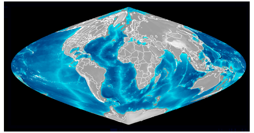
Adding an Image Under the Map
Use the Image keyword to specify the name of an image (2D array) to be drawn under the map. The image is warped to fill the entire area specified by the Range keyword.
The following example warps a 2D array of global elevation data onto a sinusoidal map projection of the earth. The map produced by this example code is shown in
Figure 12-5: Map Projection with Underlying Global Elevation Data on page 320.
; (UNIX only) Get the path/filename of file containing
; a 2D array of global elevation data.
file = '$RW_DIR/mapping-2_0/data/'+'earth_elev.dat'
; Create array to hold image.
elev = FLTARR(720, 360)
; Open and read the image data file into the array.
OPENR, 1, file, /Xdr
READU, 1, elev
CLOSE, 1
WINDOW, Xsize=720, Ysize=360, Colors=128
TVLCT, 150, 150, 150, 63
red = BYTARR(63)
grn = BYTSCL(FINDGEN(63)^2.0)
blu = BYTSCL((FINDGEN(63)))
; Define and load a colortable.
TVLCT, red, grn, blu, 0
TVLCT, 255, 255, 255, 127
; Reference the image array with the Image keyword to warp
; the image around the map projection.
MAP, Projection = 4, Range = [-180,-90,180,90], Image = elev
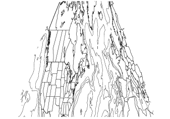
Adding Contour Lines
MAP_CONTOUR lets you overlay contours on a map. This routine works like the regular CONTOUR procedure in PV‑WAVE, except that MAP_CONTOUR assumes that the X and Y vectors specified or created by default are specified in terms of longitude and latitude coordinates.
When plotted, the contour data is projected so that the contour lines accurately describe features on the surface of the globe.
The following example plots contour data on a map. The result is shown in
Figure 12-6: Contour Lines over Map Projection on page 322.
; (UNIX only) Get the path of file containing 2D array of
; global elevations.
file = '$RW_DIR/mapping-2_0/data/' + 'earth_elev.dat'
; (Windows only) Get the path of file containing 2D array of
; global elevations.
file = '%RW_DIR%\mapping-2_0\data\' + 'earth_elev.dat'
; Create an array to hold the image.
elev = FLTARR(720, 360)
; Open and read the image data file into the array.
OPENR, 1, file, /Xdr
READU, 1, elev
CLOSE, 1
water = BYTSCL(elev, Max = 0.0, Top = 63)
land = BYTSCL(elev, Min = 0.0, Top = 63)
; Subset the array of elevation data. The elevation dataset
; contains an elevation for each degree of longitude and
; latitude, from –180 to 180 degrees longitude and
; from –90 to 90 degrees latitude. The array expressions in
; this command subset the data corresponding to the range
; of data used in the MAP procedure call.
elev = water + land
elev = REBIN(elev, 360, 180)
DATA = FLOAT(elev(-150+180:30+180, 30+90:70+90))
MAP, Projection = 4, Range = [-150, 30, 30, 70], Thick = 2
TEK_COLOR
MAP_CONTOUR, DATA, C_Colors = [2,8,16,18,20,4], $
Levels = [20,30,35,40,50]
In addition to line plot overlays, the Fill and Pattern keywords allow contours to be filled in the same way that POLYCONTOUR is used to fill contour plots. The same cautions associated with POLYCONTOUR apply, in that all contour lines must be closed. This is usually accomplished by padding the data with zeros or some other value outside the range of the data. For an example of this technique, see the POLYCONTOUR procedure in the PV‑WAVE Reference.
note | MAP_CONTOUR with the Fill keyword is not supported for projection 99 (Satellite), but good results can be obtained by creating a two-dimensional image with CONTOUR and POLYCONTOUR and then using the Image keyword with MAP to wrap this image onto the globe. |
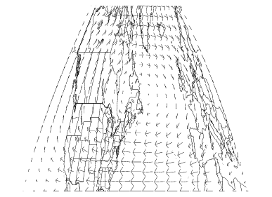
Adding Vector Lines
MAP_VELOVECT creates two-dimensional velocity vector plots. It works just like the PV‑WAVE VELOVECT procedure, except that MAP_VELOVECT takes longitude and latitude coordinates as input. When the vector lines are plotted, the current map projection is taken into account so that the vector lines are depicted accurately on the map, as shown in
Vector Lines Added to Map Projection.
u = fltarr(20, 20)
v = fltarr(20, 20)
FOR j = 0, 19 DO BEGIN
FOR i = 0, 19 DO BEGIN
x = 0.05 * float(i)
z = 0.05 * float(j)
u(i, j) = -sin(!Pi*x) * cos(!Pi*z)
v(i, j) = cos(!Pi*x) * sin(!Pi*z)
ENDFOR
ENDFOR
MAP, Projection = 4, Range = [-150, 30, 30, 70]
MAP_VELOVECT, u, v, Color = 5
Creating Filled Maps
The MAP_POLYFILL routine provides essentially the same functionality as the POLYFILL routine for plotting filled polygons, except that the data provided is assumed to be longitude/latitude data which will be projected before being plotted. Standard POLYFILL keywords such as Color, Pattern, Fill_Pattern, Line_Fill, Linestyle, Thick, Psym, Spacing and Symsize can be used to specify the characteristics of the polygon to be plotted.
note | MAP_POLYFILL cannot be used with the Satellite (3D Mapping onto a Sphere) projection. |
Version 2017.1
Copyright © 2019, Rogue Wave Software, Inc. All Rights Reserved.