Drawing X Versus Y Plots
This section illustrates the use of the basic x versus y plotting routines, PLOT and OPLOT.
The PLOT procedure produces linear-linear plots. The procedures PLOT_IO, PLOT_OI, and PLOT_OO are identical to PLOT, except they produce linear-log, log-linear, and log-log plots, respectively.
Data from the U.S. Scholastic Aptitude Test (SAT), from the years 1967, 1970, and from 1975 to 1983, are used in the following examples.
note | Variables defined in the following examples are used in later examples in this section. |
Producing a Basic XY Plot
The following statements create and initialize the variables VERBM, VERBF, MATHM, and MATHF, which contain the verbal and math scores for males and females for the 11 observations:
VERBM = [463, 459, 437, 433, 431, 433, 431, 428, 430, 431, 430]
VERBF = [468, 461, 431, 430, 427, 425, 423, 420, 418, 421, 420]
MATHM = [514, 509, 495, 497, 497, 494, 493, 491, 492, 493, 493]
MATHF = [467, 465, 449, 446, 445, 444, 443, 443, 443, 443, 445]
A vector in which each element contains the year of the score is constructed with the statement:
YEAR = [1967, 1970, INDGEN(9) + 1975]
The PLOT procedure, which produces an
x versus
y plot on a new set of axes, requires one or two parameters: a vector of
y–values, or a vector of
x–values followed by a vector of
y–values.
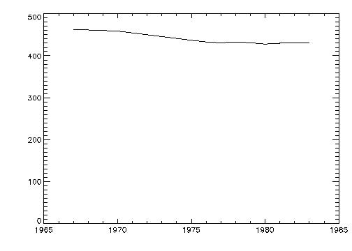
Figure 4-1: Initial 2D Plot on page 47 is produced using the statement:
PLOT, YEAR, VERBM
note | You can abort any of the higher-level graphics procedures (e.g., PLOT, OPLOT, CONTOUR, and SURFACE) by typing Control-C. |
Scaling the Plot Axes and Adding Titles
The fluctuations in the data are hard to see because the scores range from 428 to 463, and the plot’s y–axis is scaled from 0 to 500. Two factors cause this effect. By default, PV‑WAVE sets the minimum y–axis value of linear plots to 0 if the y data are all positive. The maximum axis value is automatically set from the maximum y data value. In addition, PV‑WAVE attempts to produce from 3 to 6 tick mark intervals that are in increments of an integer power of 10 times 2, 2.5, 5, or 10. In this example, this rounding effect causes the maximum axis value to be 500, rather than 463.
Using YNozero to Scale the Y–Axis
YNozero parameter inhibits setting the
y–axis minimum to 0 when given positive, non-zero data.
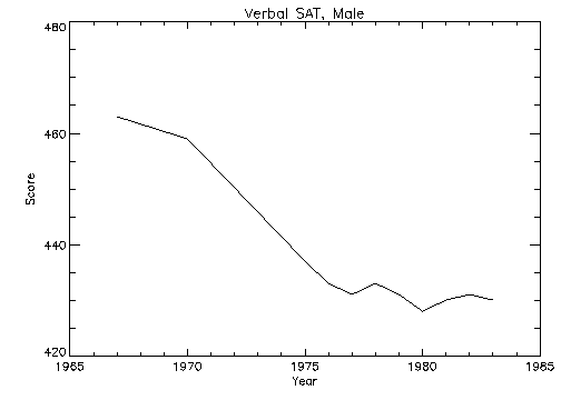
Figure 4-2: Plot with Title Annotation on page 48 illustrates the data plotted using this keyword. The
y–axis now ranges from 420 to 480, because PV‑WAVE selected 3 tick mark intervals of 20.
You can make /YNozero the default in subsequent plots by setting bit 4 of !Y.Style to 1, (!Y.Style = 16).
Other bits in the Style field of the axis system variables !X, !Y, and !Z are described in Chapter 22: System Variables of the PV‑WAVE Reference. Briefly: Other bits in the Style field extend the axes, (providing a margin around the data), suppress the axis and its notation, and suppress the box-style axes by drawing only a left and bottom axis.
Adding Titles
The
Title,
XTitle, and
YTitle keywords are used to produce axis titles and a main title in the plot shown in
Plot with Title Annotation. This figure was produced with the statement:
PLOT, YEAR, VERBM, /YNozero, Title = 'Verbal SAT, Male', $
XTitle = 'Year', YTitle = 'Score'
Specifying the Range of the Axes
The range of the x–, y–, or z–axes can be explicitly specified with the XRange, YRange, and ZRange keyword parameters. The argument of the keyword parameter is a two-element vector containing the minimum and maximum axis values.
For example, if we wish to constrain the x–axis to the years 1975 to 1983, the following keyword parameter is included in the call to PLOT:
XRange = [1975, 1983]
The effect of the YNozero keyword, explained in the previous section, is identical to that obtained by specifying the following YRange keyword parameter in the call to PLOT:
YRange = [MIN(Y), MAX(Y)]
Specifying Exact Tick Intervals with XStyle = 1
As explained in the previous section, PV‑WAVE attempts to produce even tick intervals, and the axis range selected by PV‑WAVE may be slightly larger than that given with the XRange, YRange, and ZRange keywords. To obtain the exact specified interval, set the x–axis style parameter to 1 (XStyle = 1).
The call combining all these options is:
PLOT, YEAR, VERBM, /YNozero, Title = 'Verbal SAT, Male', $
XTitle = 'Year', YTitle = 'Score', XRange = [1975, 1983], $
/XStyle
Plotting Additional Data on the Same Axes
Additional data may be added to existing plots with the OPLOT procedure. Each call to PLOT establishes the plot window (the region of the display enclosed by the axes), the axis types (linear or log), and the scaling. This information is saved in the system variables !P, !X, and !Y, and used by subsequent calls to OPLOT.
It may be useful to change the color index, linestyle, or line thickness parameters in each call to OPLOT to distinguish the data sets. For a table describing the linestyle associated with each index, see the description of the !P.Linestyle system variable in Chapter 22: System Variables of the PV‑WAVE Reference.
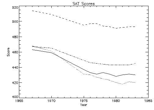
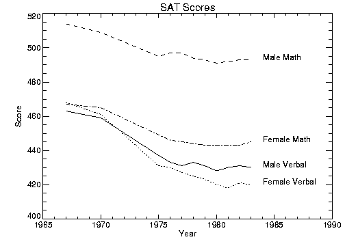
Overplotting illustrates a plot showing all four data sets,
VERBF,
VERBM,
MATHF, and
MATHM. Each data set except the first is plotted with a different line style and is produced by a call to OPLOT.
In this example, an 11-by-4 array called allpts is defined which contains all the scores for the four categories using the array concatenation operator. Once this array is defined, the array operators and functions can be applied to the entire data set, rather than explicitly referencing the particular score.
Overplotting is produced with the statements:
; Make an (n, 4) array containing the four score vectors.
allpts = [[verbf], [verbm], [mathf], [mathm]]
; Plot first graph. Set y–axis min and max from the min and max
; of all data sets. Default line style is 0. (The title keywords
; have been omitted from this example for clarity.)
PLOT, year, verbf, YRange=[MIN(allpts), MAX(allpts)]
; Loop for the three remaining scores, varying the line style.
FOR i=1, 3 do OPLOT, year, allpts(*, i), Line = i
Plotting Date/Time Axes
Using Date/Time functions, you can create Date/Time variables and automatically plot multiple Date/Time axes. For detailed information on manipulating and plotting Date/Time data, see
Working with Date/Time Data.
Annotating Plots
An obvious problem with
Figure 4-4: Overplotting on page 50 is that it lacks labels describing the different lines shown. To annotate a plot, select an appropriate font and then use the XYOUTS procedure.
Selecting Fonts
You can use software or hardware generated fonts to annotate plots.
Using Fonts explains the difference between these types of fonts and the advantages and disadvantages of each.
The annotation in
Figure 4-5: Annotation Example on page 52 uses the PostScript Helvetica font. This is selected by first setting the default font, !P.Font, to the hardware font index of 0, and then calling the DEVICE procedure to set the Helvetica font:
!P.Font = 0
SET_PLOT, 'ps'
DEVICE, /Helvetica
Other PostScript fonts and their bold, italic, oblique and other variants are described in the PV‑WAVE Reference.
Using XYOUTS to Annotate Plots
You can add labels and other annotation to your plots with the XYOUTS procedure. The XYOUTS procedure is used to write graphic text at a given location (X, Y):
XYOUTS, x, y, 'string'
For a detailed description of XYOUTS and its keywords, see the PV‑WAVE
Reference. For other tips on using XYOUTS, see
"Clipping PV‑WAVE Graphics".
illustrates one method of annotating each graph with its name. The plot is produced in the same manner as was
Figure 4-4: Overplotting on page 50, with the exception that the
x‑axis range is extended to the year 1990 to allow room for the titles. To accomplish this, the keyword parameter
XRange = [1967, 1990] is added to the call to PLOT. A string vector,
NAMES, containing the names of each score is also defined. As noted in the previous section, the PostScript Helvetica font was selected for this example.
The annotation in
Figure 4-5: Annotation Example on page 52 is produced using the statements:
; Vector containing the name of each score.
names = ['Female Verbal', 'Male Verbal', 'Female Math', $
'Male Math']
; Index of last point.
n1 = N_ELEMENTS(year) - 1
; Append the title of each graph on the right.
FOR i=0,3 do XYOUTS, 1984, allpts(n1,i), names(i)
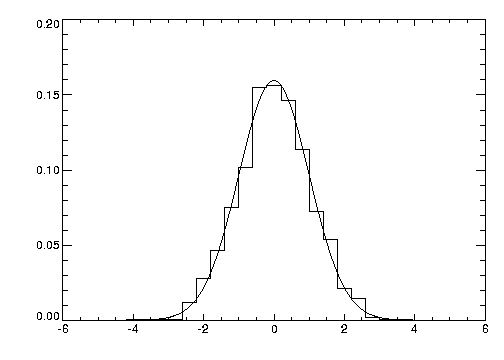
Plotting in Histogram Mode
You can produce a histogram-style plot by setting the Psym keyword to 10 in the PLOT procedure call:
Psym = 10
This connects data points with vertical and horizontal lines, producing the histogram.
Figure 4-6: Histogram Plot on page 53 illustrates this by comparing the distribution of the normally distributed random number function (RANDOMN), to the theoretical normal distribution:
This figure is produced using the following statements:
; Generate 200 values ranging from –5 to 5.
X = FINDGEN(200) / 20. - 5.
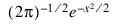
; Theoretical normal distribution, integral scaled to one.
Y = 1 / SQRT(2. * !PI) * EXP(-X^2 / 2) *(10. / 200)
; Approximate a normal distribution with RANDOM and then
; form the histogram.
H = HISTOGRAM(RANDOMN(Seed, 2000), BINSIZE = 0.4, min = -5., $
max = 5.)/2000.
; Plot the approximation using “histogram mode”.
PLOT, FINDGEN(26) * 0.4 - 4.8, H, PSYM = 10
; Overplot actual distribution.
OPLOT, X, Y*8.
Using Different Marker Symbols
Each data point may be marked with a symbol and/or connected with lines. The value of the keyword parameter Psym selects the marker symbol. Psym is described in detail in Chapter 21: Graphics and Plotting Keywords of the PV‑WAVE Reference.
For example, a value of 1 marks each data point with the plus sign, 2 is an asterisk, etc. Setting Psym to minus the symbol number marks the points with a symbol and connects them with lines. For example, a value of –1 marks points with a plus sign and connects them with lines.
Note also that setting Psym to a value of 10 produces histogram-style plots, as described in the previous section.
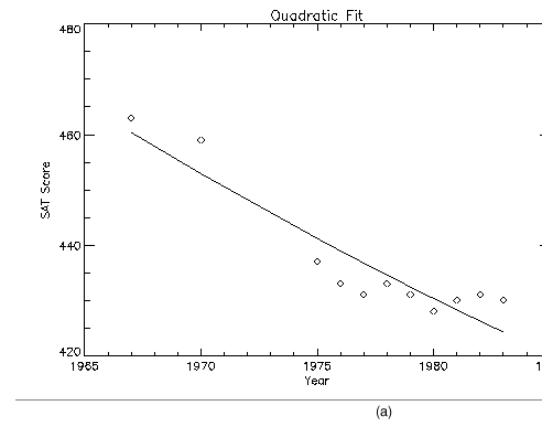
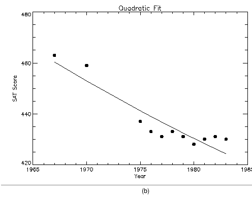
Frequently, when data points are plotted against the results of a fit or model, symbols are used to mark the data points while the model is plotted using a line.
Plotting with Symbols illustrates this, fitting the male verbal scores to a quadratic function of the year. The predefined symbols are shown in (a) and the user-defined symbols are shown in (b). The POLY_FIT function is used to calculate the quadratic. The statements used to construct this plot are:
; Use the POLY_FIT function to obtain a quadratic fit.
COEFF = POLY_FIT(YEAR, VERBM, 2, YFIT)
; Plot the original data points with Psym = 4.
PLOT, YEAR, VERBM, /YNozero, Psym = 4, Title = 'Quadratic Fit', $
XTitle = 'Year', YTitle = 'SAT Score'
; Overplot the smooth curve using a plain line.
OPLOT, YEAR, YFIT
Defining Your Own Marker Symbols
The USERSYM procedure allows you to define your own symbols by supplying the coordinates of the lines used to draw the symbol. The symbol you define may be drawn using lines, or it may be filled using the polygon filling operator. USERSYM accepts two vector parameters: a vector of x–values and a vector of y‑values.
The coordinate system you use to define the symbol’s shape is centered on each data point and each unit is approximately the size of a character. For example, to define the simplest symbol, a one-character wide dash, centered over the data point:
USERSYM, [-.5,.5],[0,0]
The color and line thickness used to draw the symbols are also optional keyword parameters of USERSYM.
Figure 4-7: Plotting with Symbols on page 56 illustrates the use of USERSYM to define a new symbol, a filled circle. It is produced in exactly the same manner as the example in the previous section, with the exception of the addition of the following statements that define the marker symbol and use it.
; Make a vector of 16 points, ai = 2πi / 16.
A = FINDGEN(16) * ( !Pi * 2 / 16. )
; Define symbol as a unit circle, with 16 points, set filled flag.
USERSYM, COS(A), SIN(A), /Fill
; As in the previous section, but use symbol index 8 to select
; user-defined symbols.
PLOT, YEAR, VERBM, /YNozero, Psym = 8, ...
Using Color and Pattern to Highlight Plots
Many scientific graphs use region filling to highlight the difference between two or more curves (i.e., to illustrate boundaries, etc.). Given a list of vertices, the procedure POLYFILL fills the interior of an arbitrary polygon. The interior of the polygon may be filled with a solid color or, with some devices, a user-defined pattern contained in a rectangular array.
note | The Pattern keyword is not available for the POLYFILL procedure. |
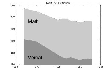
Using POLYFILL illustrates a simple example of polygon filling by filling the region under the male math scores with a color index of 75% the maximum, and then filling the region under the male verbal scores with a 50% of maximum index. Because the male math scores are always higher than the verbal, the graph appears as two distinct regions.
The following discussion describes the program that produced
Figure 4-8: Using POLYFILL on page 58. First, a plot axis is drawn with no data, using the
Nodata keyword. The minimum and maximum
y–values are directly specified with the
YRange keyword. Because the
y–axis range does not always exactly include the specified interval (see
"Scaling the Plot Axes and Adding Titles"), the variable
MINVAL, is set to the current
y‑axis minimum, !Y.Crange(0). Next, the upper math score region is shaded with a polygon containing the vertices of the math scores, preceded and followed by points on the
x–axis, (
YEAR(0), MINVAL), and (
YEAR(n – 1), MINVAL).
The polygon for the verbal scores is drawn using the same method with a different color. Finally, the XYOUTS procedure is used to annotate the two regions.
; Use hardware fonts.
!P.Font = 0
; Set font to Helvetica.
DEVICE, /Helvetica
; Draw axes, no data, set the range.
PLOT, year, mathm, YRange = [MIN(verbm), $
MAX(mathm)], /Nodata, Title = 'Male SAT Scores'
; Make vector of x–values for the polygon by duplicating the first
; and last points.
pxval = [year(0), year, year(n1)]
; Get y–value along bottom x–axis.
minval = !Y.Crange(0)
; Make a polygon by extending the edges of the math score
; down to the x–axis.
POLYFILL, pxval, [minval, mathm, minval], $
COL = 0.75 * !D.N_Colors
; Same with verbal.
POLYFILL, pxval, [minval, verbm, minval], $
COL = 0.50 * !D.N_Colors
; Label the polygons.
XYOUTS, 1968, 430, 'Verbal', Size = 2
XYOUTS, 1968, 490, 'Math', Size = 2
Drawing Bar Charts
Bar charts are used in business-style graphics and are useful in comparing a small number of measurements within a few discrete data sets. PV‑WAVE can produce many types of business-style plots with a little effort.
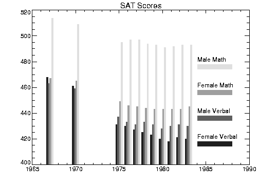
The following example produces a bar-style chart showing the four SAT scores as boxes of differing colors or shading. The program used to draw
Bar Chart with POLYFILL is shown below and annotated. A procedure called BOX is defined which draws a box given the coordinates of two diagonal corners.
As in the previous example, the PLOT procedure is used to draw the axes and establish the scaling using the Nodata keyword.
PRO BOX, x0, y0, x1, y1, color
; Draw a box, using polyfill, whose corners are (x0, y0),
; and (x1,y1).
POLYFILL, [x0,x0,x1,x1], [y0,y1,y1,y0], col = color
END
; Make a vector of colors for each score.
colors = 64 * INDGEN(4) + 32
; Use PLOT to draw the axes and set the scaling.
; Draw no data points, explicitly set the x– and y–ranges.
PLOT, year, mathm, YRange = [MIN(allpts), MAX(allpts)], $
Title = 'SAT Scores', /Nodata, XRange = [year(0), 1990]
; Get the y–value of the bottom x–axis.
minval = !Y.Crange(0)
; Width of bars in data units.
del = 1./5.
; Loop for each score.
FOR iscore = 0,3 DO BEGIN
; Annotation of y–value. Vertical separation is 20 data units.
yannot = minval + 20 *(iscore+1)
; Label for each bar.
XYOUTS, 1984, yannot, names(iscore)
; Bar for annotation.
BOX, 1984, yannot-6, 1988, yannot-2, colors(iscore)
; Vertical bar x–offset for each score.
xoff = iscore * del - 2 * del
; Draw a vertical box for each year's score.
FOR iyr = 0, N_ELEMENTS(year)-1 DO $
BOX, year(iyr)+xoff, minval, year(iyr) $
+ xoff+del, allpts(iyr, iscore), colors(iscore)
ENDFOR
Controlling Tick Marks
You have almost complete control over the number, style, placement, and annotation of the tick marks. The following plotting keywords are used to control tick marks:
Gridstyle | XTicklen | YTickformat | ZMinor |
Tickformat | XTickname | YTicklen | ZTickformat |
Ticklen | XTicks | YTickname | ZTicklen |
XGridstyle | XTickv | YTicks | ZTickname |
XMinor | YGridstyle | YTickv | ZTicks |
XTickformat | YMinor | ZGridstyle | ZTickv |
For detailed descriptions of these keywords, see Chapter 21: Graphics and Plotting Keywords of the PV‑WAVE Reference.
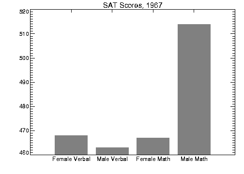
Example 1: Specifying Tick Labels and Values
Figure 4-10: User-defined Tick Marks and Labels on page 62 is a bar chart illustrating the direct specification of the
x–axis tick values, number of ticks, and tick names. Building upon the BOX program described in the previous section, this program shows each of the four scores for the year 1967, the first year in the data. The
BOX procedure is used to draw a rectangle for each score. Using the same data and variables from that example, the program for specifying tick labels and values is as follows.
; Tick x–values, 0.2, 0.4, 0.6, 0.8.
xval = FINDGEN(4)/5. + .2
; Make a vector of scores from the first year, corresponding to
; the names vector from the previous example.
yval = [verbf(0), verbm(0), mathf(0), mathm(0)]
; Make the axes with no data. Force x–range to [0,1],
; centering xval, which also contains the tick values. Force
; three tick intervals making four tick marks. Specify the
; tick names from the names vector.
PLOT, xval, yval, /YNozero, XRange = [0,1], XTickv = xval, $
XTicks = 3, XTickname = names, /Nodata, $
Title = 'SAT Scores, 1967'
; Draw the boxes, centered over the tick marks.
; !Y.Crange(0) is the y–value of the bottom x–axis.
FOR i=0, 3 DO BOX, xval(i) - .08, $
!Y.Crange(0), xval(i)+0.08, yval(i), 128
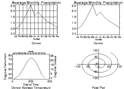
Example 2: Specifying Tick Lengths
Figure 4-11: Extending Tick Marks on page 63 illustrates the effects of changing the
Ticklen keyword. The left plot shows a full grid produced with tick mark lengths of 0.5. The right plot shows outward-extending tick marks produced by setting the
Ticklen keyword to –0.02. Outward extending ticks are useful in that they do not obscure the data inside the window. These two plots were produced with the following code:
; Define 12 monthly precipitation values.
precip = [ ... ... ... ]
; Define 12 monthly average temperature.
temp = [ ... ... ... ]
; Define names of months.
month = ['Ja', 'Fe', 'Ma', 'Ap', 'Ma', 'Ju', 'Ju', 'Au', 'Se', $
'Oc', 'No', 'De']
; Vector containing approximate day number of middle of each
; month.
day = FINDGEN(12) * 30 + 15
; Plot, setting tick mark length to full, and setting the
; number, position and labels of the ticks.
PLOT, day, precip, XTicks = 11, XTickname = month, Ticklen = 0.5,$
XTickv = day, Title = 'Average Monthly Precipitation', $
XTitle = 'Inches', Subtitle = 'Denver'
; As above, setting tick mark length for outside ticks.
PLOT, day, precip, XTicks = 11, XTickname = month, $
Ticklen = -0.02, XTickv = day, $
Title = 'Average Monthly Precipitation', XTitle = 'Inches',$
Subtitle = 'Denver'
note | Use the Gridstyle, XGridstyle, YGridstyle, and ZGridstyle keywords to change the linestyle of tick marks from solid to dashed, dotted, or other styles. One use is to create a dotted or dashed grid on the plot region. To do this, first set the Ticklen keyword to 0.5, and then set the Gridstyle keyword to the value of the linestyle you want to use. For more information on using the Gridstyle keywords, see Chapter 21: Graphics and Plotting Keywords of the PV‑WAVE Reference. |
Example 3: Specifying Tick Label Formats
The XTickformat, YTickformat, and ZTickformat keywords let you change the default format of tick labels. These keywords use the F (floating-point), I (integer), and E (scientific notation) format specifiers to specify the format of the tick labels. These format specifiers are similar to the ones used in FORTRAN and are discussed in the PV‑WAVE Reference.
For example:
PLOT, mydata, XTickformat='(F5.2)'
The resulting plot’s tick labels are formatted with a total width of five characters and carried to two decimal places. As expected, the width field expands automatically to accommodate larger values. For example, the x–axis tick labels for this plot might look like this:
40.00 400.00 4000.00 40000.00
You can easily reformat the labels in scientific notation using the E format specifier. For example:
PLOT_OO, mydata, YTickformat='(E6.2)'
The resulting y–axis tick labels for this plot might look like this:
1.00e-08 1.00e-06 1.00e-04 1.00e-02
Like many of the keywords used with the plotting procedures, corresponding system variables allow you to change the normal defaults. The corresponding system variables for the Tickformat keywords are: !X.Tickformat, !Y.Tickformat, and !Z.Tickformat. The system variable !P.Tickformat lets you set the tick label format for all three axes.
note | Only the I (integer), F (floating-point), and E (scientific notation) format specifiers can be used with the Tickformat keywords. Also, you cannot place a quoted string inside a tick format. For example, ('<', F5.2, '>') is an invalid Tickformat specification. |
Drawing Multiple Plots on a Page
Plots may be grouped on the display or page in the horizontal and/or vertical directions using the !P.Multi system variable field. PV‑WAVE sets the plot window to produce the given number of plots on each page and moves the window to a new sector at the beginning of each plot. If the page is full, it is first erased. If more than two rows or columns of plots are produced, PV‑WAVE decreases the character size by a factor of 2.
!P.Multi controls the output of multiple plots and is an integer vector in which:

!P.Multi(0)—The number of empty sectors remaining on the page. The display is erased if this field is 0 when a new plot is begun.
!P.Multi(1)—The number of plots across the page.
!P.Multi(2)—The number of plots per page in the vertical direction.
For example, to stack two plots vertically on each page specify the following value for !P.Multi.
!P.Multi = [0,1,2]
Note that the first element, !P.Multi(0), is set to zero to cause the next plot to begin a new page. To make four plots per page, with two columns and two rows:
!P.Multi = [0,2,2]
Multiple Plots illustrates the two rows and two columns format. Use the following command to reset the display to the default setting of one plot per page.
!P.Multi = 0
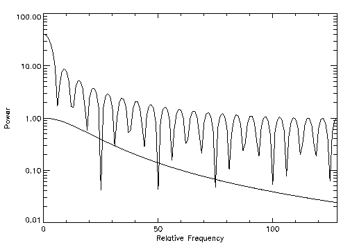
Plotting with Logarithmic Scaling
The XType, YType, and ZType keywords can be used with PLOT to get any combination of linear and logarithmic axes. In addition, logarithmic scaling may be achieved by calling PLOT_IO (linear x–axis, log y–axis), PLOT_OI (log x, linear y), or PLOT_OO (log x, log y). The OPLOT procedure uses the same scaling and transformation as the most recent plot.
Figure 4-13: Logarithmic Scaling Plot on page 66 illustrates the use of PLOT_IO to make a linear-log plot. It is produced using the following statements:
; Create data array.
X = FLTARR(256)
; Make a step function.
X(80:120) = 1
; Make a filter symmetrical about x = 64.
FREQ = FINDGEN(256)
FREQ = FREQ < (256-FREQ)
; A 2nd order Butterworth, with acutoff frequency = 20.
FIL = 1. / (1+(FREQ / 20) ^2)
; Plot with a logarithmic x–axis. Use exact axis range.
PLOT_IO, FREQ, ABS(FFT(X,1)), XTitle = 'Relative Frequency', $
YTitle = 'Power', XStyle = 1
OPLOT, FREQ, FIL
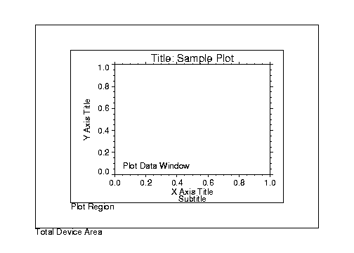
Specifying the Location of the Plot
The
plot data window is the region of the page or screen enclosed by the axes. The
plot region is the box enclosing the plot data window and the titles and tick annotation.
Figure 4-14: Plot Locations on page 67 illustrates the relationship of the plot data window, plot region, and the entire device area (or window if using a windowing device).
These areas are determined by the following system variables and keyword parameters, in order of decreasing precedence. Each of these keywords and system variables are described in Chapter 21: Graphics and Plotting Keywords and Chapter 22: System Variables of the PV‑WAVE Reference.
Position keyword
!P.Position system variable
!P.Region system variable
!P.Multi system variable
XMargin,
YMargin, and
ZMargin keywords
!X.Margin, !Y.Margin, and !Z.Margin system variables
Drawing Additional Axes on Plots
The AXIS procedure draws and annotates an axis. It optionally saves the scaling established by the axis for use by subsequent graphics procedures. It may be used to add additional axes to plots, or to draw axes at a specified position.
The AXIS procedure accepts the set of plotting keyword parameters that govern the scaling and appearance of the axes. In addition, the keyword parameters XAxis, YAxis, and ZAxis specify the orientation and position (if no position coordinates are present), of the axis. The values of these parameters are: 0 for the bottom or left axis, and 1 for the top or right. The tick marks and their annotation extend away from the plot window. For example, specify YAXIS = 1 to draw a y–axis on the right of the window.
The optional keyword parameter Save saves the data-scaling parameters established for the axis in the appropriate axis system variable, !X, !Y, or !Z.
The call to AXIS is:
AXIS [[, x, y], z]
where x, y, and optionally z specify the coordinates of the axis. By including the appropriate keyword parameter (Device, Normal, or Data) you can specify a coordinate system. The coordinate corresponding to the axis direction is ignored when specifying an x–axis, the x coordinate parameter is ignored, but must be present if there is a y coordinate.
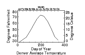
Drawing Additional Axes Example
Axes using Multiple Scales illustrates using AXIS to draw axes with a different scale, opposite the main
x– and
y–axis.
The plot is produced using PLOT with the bottom and left axes annotated and scaled in units of days and degrees Fahrenheit, respectively. The XMargin and YMargin keyword parameters are specified to allow additional room around the plot window for the new axes. The keyword parameters XStyle = 8 and YStyle = 8 inhibit drawing the top and right axes.
Next, the AXIS procedure is called to draw the top axis, (XAxis = 1), labeled in months. Eleven tick intervals, with 12 tick marks are drawn. Each monthly tick mark’s x–value is the day of the year of approximately the middle of the month. Tick mark names come from the MONTH string array.
The right y–axis, YAxis = 1, is drawn in the same manner. The new y–axis range is set by converting the original y–axis minimum and maximum values, saved by PLOT in !Y.Crange, from Fahrenheit to Celsius, using the formula C = 5(F – 32) / 9. The keyword parameter YStyle = 1 forces the y–axis range to match the given range exactly. The commands are:
; Plot the data, omitting the right and top axes.
PLOT, day, temp, /YNozero, Subtitle = $
'Denver Average Temperature', XTitle  = 'Day of Year', $
YTitle = 'Degrees Fahrenheit', XStyle = 8, YStyle = 8, $
XMargin = [8,8], YMargin = [4,4]
; Draw the top x–axis, supplying labels, etc. Make the characters
; smaller so they will fit.
AXIS, XAxis = 1, XTicks = 11, XTickv = day, XTickname = month, $
XTitle = 'Month', XCharsize = 0.7
; Draw the right y–axis. Scale the current y–axis minimum
; values from Fahrenheit to Celsius, and make them the new
; min and max values. Set YStyle to 1 to make the axis exact.
AXIS, YAxis = 1, YRange = (!Y.Crange–32)*5. /9., YStyle = 1, $
YTitle = 'Degrees Celsius'
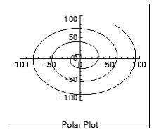
Drawing Polar Plots
The PLOT procedure converts its coordinates from cartesian to polar coordinates when plotting if the Polar keyword parameter is set. The first parameter to plot is the radius, R, and the second is θ, expressed in radians. Polar plots are produced using the standard axis and label styles—with box axes enclosing the plot area.
Figure 4-16: Polar Plot on page 70 illustrates using AXIS to draw centered axes, dividing the plot window into the four quadrants centered about the origin. This method uses PLOT to plot the polar data and to establish the coordinate scaling, but suppresses the axes. Next, two calls to AXIS add the
x– and
y–axes, drawn through data coordinate (0,0):
; Make a radius vector and add a theta vector.
r = FINDGEN(100)
theta = r/5
; Plot the data, suppressing axes by setting their styles to 4.
PLOT, r, theta, Subtitle = 'Polar Plot', XStyle = 4, $
YStyle = 4, /Polar
; Draw the x– and y–axes through (0,0).
AXIS, XAxis = 0, 0, 0
AXIS, YAxis = 0, 0, 0
Clipping PV‑WAVE Graphics
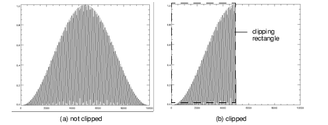
Clipping removes data from a specified region of the display device. Keywords provided with the PV‑WAVE graphics commands let you specify how clipping is done.
The clipping concept can be described in terms of a “clipping rectangle.” Graphics that fall inside the clipping rectangle are displayed; graphics that fall outside the rectangle are not—they are clipped.
For example, the following commands produce the graphics shown in
Clipping a Graphic:
; Produces the graphic on the left (a). Data is not clipped.
PLOT, HANNING(100,100)
; Produces graphic on the right (b). Data is clipped outside the
; clipping rectangle, which is defined with the Clip keyword.
PLOT, HANNING(100,100), Clip=[0,0, 5000,1]
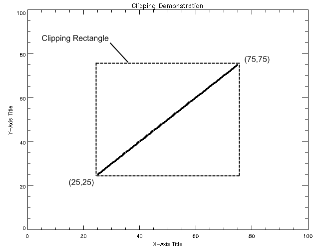
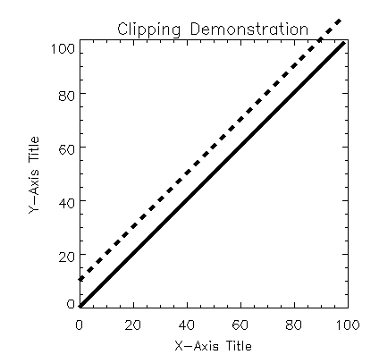
Defining a Clipping Rectangle
Clipping Rectangle shows a plot that is clipped. The dashed line shows the clipping rectangle. (This line does not appear on the actual PV‑WAVE plot.) Note that all of the data that falls outside this rectangle is clipped. The data that falls inside the rectangle is displayed normally. The
Clip keyword is used to define the clipping rectangle as follows:
PLOT, INDGEN(100), Clip=[25,25,75,75]
Clip specifies the lower-left and upper-right corners of a rectangle:
Clip = [X0, Y0, X1, Y1]
By default, the Clip keyword accepts data coordinates.
Graphics outside the boundary of the clipping rectangle are not displayed—they are clipped.
How is Clipping Controlled in PV‑WAVE?
The following graphics keywords and system variables control clipping. They are listed here in their order of precedence. The first keyword in the list, NoClip, takes precedence over all the other keywords and system variables below it, and so on.
1. NoClip (graphics keyword)
2. Clip (graphics keyword)
3. PClip (graphics keyword)
4. !P.NoClip (system variable)
5. !P.Clip (system variable)
The following sections explain how these keywords and system variables are used to control clipping of PV‑WAVE graphics.
For more information on these keywords and system variables, see Chapter 21: Graphics and Plotting Keywords and Chapter 22: System Variables of the PV‑WAVE Reference.
Which PV‑WAVE Commands Use Clipping
The graphics procedures that use clipping are:
PLOT
OPLOT
POLYFILL
PLOTS
XYOUTS
The way clipping works depends on the graphics command you are using. The table in the next section breaks these commands into three groupings. Each grouping handles clipping in the same way. That is, each group has the same clipping defaults, accepts the same clipping keywords, and reads the same clipping system variables.
Notes on the Keywords and System Variables
The Clip keyword takes data coordinates by default. To clip in normal or device coordinates, add /Device or /Normal to the graphics command.
When you call PLOT, the value of !P.Clip is set to a default value. This value depends on the current device. Setting the Clip keyword has no effect on !P.Clip.
The default clipping rectangle for OPLOT is defined by the value of !P.Clip. !P.Clip is set by the call to PLOT, CONTOUR, or SURFACE.
Since clipping is disabled for PLOTS, POLYFILL, and XYOUTS by default, the NoClip keyword has little importance for these commands.
Changing the value of the !P.NoClip system variable has no effect on PLOTS, POLYFILL, and XYOUTS.
Examples
The following examples illustrate how clipping works for specific combinations of two-dimensional plotting routines, and the clipping keywords and system variables.
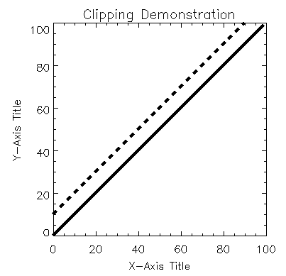
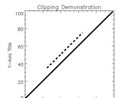
OPLOT Default Clipping
In this example, PLOT plots a solid line, then OPLOT plots a dotted line. The dotted line is clipped at the boundary of the axes (the default clipping rectangle defined in the !P.Clip system variable).
PLOT, INDGEN(100)
OPLOT, INDGEN(100)+10, Linestyle=2
Figure 4-19: OPLOT Clipping on page 76 shows the default clipping of the OPLOT line at the at the boundaries of the axes set up for the PLOT line.
OPLOT with NoClip Keyword
In the next example, the NoClip keyword is added to the OPLOT command. This overrides the default clipping rectangle defined by !P.Clip, and the dotted line extends beyond the boundary of the coordinate axes.
PLOT, INDGEN(100)
OPLOT, INDGEN(100)+10, LineStyle=2, /NoClip
The effect of specifying the
NoClip keyword in an OPLOT command is shown in
Figure 4-20: OPLOT with NoClip Keyword on page 77.
OPLOT with Clip Keyword
Finally, the Clip keyword is used with OPLOT, and only the dotted line is clipped.
PLOT, INDGEN(100)
OPLOT, INDGEN(100) + 10, LineStyle = 2, Clip = [25, 25, 75, 75]
OPLOT with Clip Keyword shows the graphic with only the OPLOT line clipped.
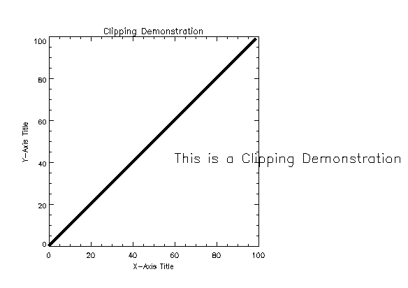
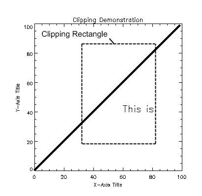
XYOUTS Default Clipping
When PLOTS, POLYFILL, or XYOUTS is called, clipping is disabled by default (that is, the value of the !P.Clip system variable is ignored). In this example, the text drawn by XYOUTS extends well beyond the coordinate axes into the device region.
PLOT, INDGEN(100)
XYOUTS, 60, 40, 'This is a Clipping Demonstration'
XYOUTS Clipping shows the result of the code. Note that the text specified by the XYOUTS procedure is not affected by any axis-boundary default clipping.
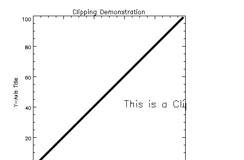
XYOUTS with PClip Keyword
In the next example, the PClip keyword is used. This keyword overrides the default clipping condition for XYOUTS, PLOTS, and POLYFILL. PClip causes the value of !P.Clip to be recognized for these commands, and graphics (or text) are clipped at the boundary of the coordinate axes.
PLOT, INDGEN(100)
XYOUTS, 60,40, 'This is a Clipping Demonstration', /PClip
By using the
PClip keyword with XYOUTS, the text is contained within the coordinate boundaries of the graphic as shown in
XYOUTS with PClip Keyword.
XYOUTS with Clip Keyword
Finally, the Clip keyword is used with a XYOUTS. Clip works the same way with all graphics functions — it defines a clipping rectangle within the plot data region. In this example, the text drawn by XYOUTS is clipped everywhere outside the clipping rectangle.
PLOT, INDGEN(100)
XYOUTS, 60,40, Clip=[40,20,80,80], $
'This is a Clipping Demonstration'
XYOUTS with Clip Keyword demonstrates the ability to clip the XYOUTS procedure text within the coordinate boundaries of the graphic using the
Clip keyword.
Version 2017.1
Copyright © 2019, Rogue Wave Software, Inc. All Rights Reserved.