Creating and Arranging Wave Widgets
This section explains the widget hierarchy, lists the general types of widgets that are available, and explains how to arrange widgets in a layout.
The Widget Hierarchy
Wave Widgets applications consist of a hierarchy of widgets. The widget hierarchy refers to the top-level or root widget and all of the widgets that are related to it. The relationship between widgets in a hierarchy is usually described as a “parent/child” relationship. Each time you create a new widget, you must specify its parent.
At the top of every widget hierarchy must be a special type of widget called the root or main window. This window is created by the WwInit function. The root window widget provides an interface between the widget hierarchy and the window manager. In addition, WwInit creates a “layout” widget, which is like a container in which other widgets are arranged.
note | You can create additional main windows with the WwMainWindow function. |
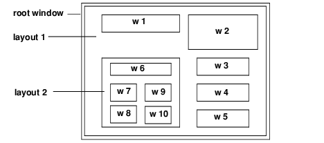
Schematic of Wave Widgets GUI shows a Wave Widgets GUI composed of a root window, two layout widgets, and ten other widgets (w 1 – w 10). These widgets could be buttons, sliders, menu bars, etc.
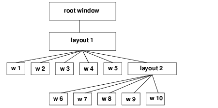
Widget Hierarchy shows the hierarchical relationship between the widgets. The root window is the top-level window, and it is the parent of layout 1 (both the root window and the first layout widget are created by WwInit). Layout 1 is the parent of widgets w 1, w 2, w 3, w 4, w 5, and layout 2. Layout 2 is the parent of widgets w 6, w 7, w 8, w 9, and w 10.
Each separate widget is represented externally by a widget ID (a variable of type long), returned by the creation function, such as WwButtonBox.
Types of Wave Widgets
The following is a list of the kinds of widgets you can create with Wave Widgets. Examples are shown throughout this chapter.
 Command Widget
—A widget used for command entry with a built-in command history mechanism. It includes an input text field, a label, and a command history list. See
"Creating a Command Widget" for more information.
Controls Box—Horizontally or vertically oriented sliders, which can optionally contain text input fields for entering exact values. A slider allows the user to set or display the values of the variables that fall within a predefined range. See
"Creating a Controls Box with Sliders" for more information.
Dialog Box—A blocking (modal) or nonblocking (modeless) dialog box containing a text input field and button box with control buttons. See
"Creating Dialog Boxes" for more information.
Layout Widget—A “container” used to hold other widgets in a specific arrangement. Types of arrangements include: row/column, form, and bulletin board. Keywords are used to select the type of layout and the orientation, spacing, and sizing of the widgets in the layout. By default, a layout widget is created when Wave Widgets is initialized with the WwInit command. See
"Creating and Arranging Wave Widgets" for more information.
List Box—A scrolling list that allows users to select one or more items from a group of choices using the mouse. An additional callback can be defined for the default action, activated with a double-click. See
"Creating a Scrolling List" for more information.
Main Window—A top-level (window manager) window and layout widget. By default, the WwInit function creates a top-level widget and a layout widget. WwMainWindow lets you create additional top-level and layout widgets.
Message Box—A popup message box containing a text message, which can be blocking or nonblocking. See
"Creating Popup Messages" for more information.
Popup Menu—A menu that appears when the user presses the right mouse button over a parent widget. See
"Creating and Handling Menus" for more information.
Radio Box—A specified number of rows or columns of labeled toggle buttons. See
"Creating a Radio Box" for more information.
Text Area—A static text label, a text entry field, or a full window editor. See
"Creating a Text Widget" for more information.
Arranging Widgets in a Layout
A layout widget is like the canvas on which other widgets are drawn in whatever arrangement you specify. All types of widgets, except the root window and popup widgets, must be related to a layout widget.
The WwInit function creates a main window and one layout widget by default. Additional layout widgets can be created with the WwLayout function.
A layout widget allows three types of basic arrangements:
Row/column layout
Bulletin Board layout
Form layout
In addition, layout widgets can be embedded within other layout widgets to create more complex GUIs.
Row/Column Layout
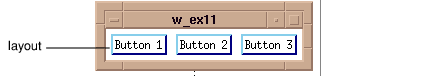
Row/column is the default layout. A row/column layout consists of widgets arranged either horizontally or vertically depending on the keywords used. The following commands create a row/column layout, where the widgets are horizontally aligned, with five pixels of space between each widget and widget borders three pixels wide. The result is shown in
Horizontally aligned layout with three buttons (Motif style).
top=WwInit('ww_ex3', 'Examples', layout, /Horizontal, $
Spacing=5, Border=3)
btn1=WwButtonBox(layout,'Button 1', 'CB')
btn2=WwButtonBox(layout,'Button 2', 'CB')
btn3=WwButtonBox(layout,'Button 3', 'CB')
status=WwSetValue(top, /Display)
WwLoop
Bulletin Board Layout
To create a bulletin board layout, the WwInit or WwLayout function is used with the Board keyword.
Each widget is positioned on the bulletin board with the Position keyword, which specifies x and y coordinates. By default, widgets are placed in the upper-left corner of the bulletin board (coordinates x=0, y=0).
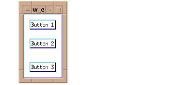
For example, the following calls position button widgets on the bulletin board called
bboard. Note that the positions of the buttons are specified with the
Position keyword. The result is shown in
Bulletin board layout (Motif style).
top=WwInit('ww_ex4', 'Examples', bboard, /Board)btn1=WwButtonBox(bboard,'Button 1', 'CB', Position=[0,0])
btn2=WwButtonBox(bboard,'Button 2', 'CB', Position=[0,50])
btn3=WwButtonBox(bboard,'Button 3', 'CB', Position=[0,100])
status=WwSetValue(top, /Display)
WwLoop
Form Layout: Attachments
On a form layout, widgets are “attached” to one another. These attachments are specified with the keywords Top, Bottom, Right, and Left. You can specify widget attachments in relation to the parent widget or in relation to other child widgets. Many combinations of attachments are possible, and it is best to experiment with the attachment keywords to produce the desired effect.
For example, the following call creates a form layout called ctrls:
ctrls=WwLayout(top, /Form)
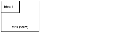
If no attachment keyword is specified, a child widget bbox1 is placed in the upper left corner of the layout. For example:
bbox1=WwButtonBox(ctrls, 'Click Here', 'buttonCB')
The result is illustrated in the following figure:
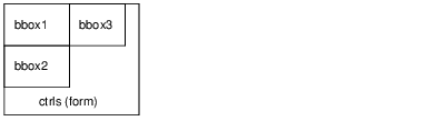
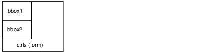
The next call places another button in the layout. This attachment places the top of bbox2 on the bottom of bbox1, as shown in the following figure.
bbox2=WwButtonBox(ctrls, 'Click Here', 'buttonCB', Top=bbox1)
The third button is attached to the right edge of the first button, bbox1, as shown in the following figure.
bbox3=WwButtonBox(ctrls, 'Click Here', 'buttonCB', Left=bbox1)
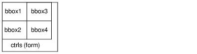
Finally, a fourth button is attached to bottom of the third button and to the left of the second button, as shown in the following figure.
bbox4=WwButtonBox(ctrls, 'Click Here', $
'buttonCB', Left=Box2, Top=bbox3)
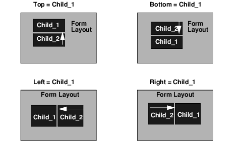
Attachment Keywords Specifying Attachments summarizes the general effect of widget attachments specified for the widget
Child_2 in relation to the widget
Child_1.
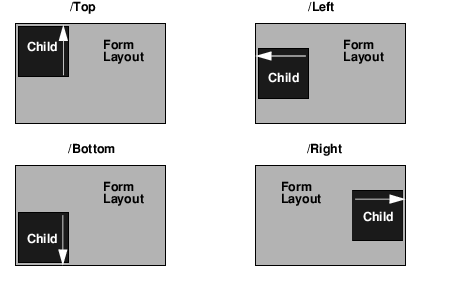
You can also specify attachment keywords with a value of one (Keyword = 1). This positions widgets in relation to the parent layout. For example:
bbox1=WwButtonBox(layout, 'Click Here', 'buttonCB', /Bottom)
This call attaches the widget bbox1 to the bottom of the parent layout widget layout. These default attachments are always specified in relation to the parent widget.
Default Attachment Effects summarizes the effect of some basic attachment keyword defaults (
Keyword = 1).
Tab Navigation Behavior for Microsoft Windows
Use the Tab key on Windows to navigate between certain widgets in your Graphical User Interface (GUI). Tabbing is implemented as a listener on the active widget. This means that if the widget that has focus either does not allow tabbing or has it disabled you cannot tab away from that widget.
For information about which widgets can use this functionality and specific behavior notes, see the Keywords section of each widget's documentation. The following widgets support this functionality:
WwToolBox | WwText |
WwRadioBox | WwControlsBox |
WwList | WtSet |
WwButtonBox | WwSetValue |
The tab navigation feature is enabled by default for all WAVE Widgets that allow tabbing. You can modify this in any of the following ways:
Disable tabbing when you create the widget using the
Tab_WinOff keyword.
Enable or disable tabbing after a widget has been created using WtSet or WwSetValue.
Disable tabbing altogether by setting the system variable !TAB_WIN to 0.
Version 2017.1
Copyright © 2019, Rogue Wave Software, Inc. All Rights Reserved.