Lesson 2: Contour Plotting
PV-WAVE provides many techniques, including contour plots, wire-mesh surfaces, and shaded surfaces, for visualizing 2D arrays. This lesson demonstrates the following:
Access the Data
First, you need a 2D data set to visualize. This example is a freely formatted file of the Pikes Peak, Colorado, region. The data set contains information about latitude, longitude, elevation, and snow depth, with 2400 single values per variable.
note | If you are continuing from the previous lesson, you do not need to load this data and can skip this section. |
To read the Pikes Peak data, do the following:
1. Read the data file, using status as the value returned by DC_READ_FREE. Enter:
status = DC_READ_FREE(!Data_Dir + 'wd_pike_elev.dat', $
lat, lon, elev, depth, /Column)
2. Use the INFO command to verify that the new variables lat, lon, elev, and depth were created. This command also tells you about the size and data type of the arrays:
INFO
Something similar to the following appears:
WAVE> INFO
% At $MAIN$ .
Code area used: 0.00% (0/768), Data area used: 1.00% (80/8000)
# local variables (including 0 parameters): 5/500
# common symbols: 0/0
LAT FLOAT = Array(2400)
LON FLOAT = Array(2400)
ELEV FLOAT = Array(2400)
DEPTH FLOAT = Array(2400)
STATUS LONG = 0
Saved Procedures:
SETDEMO SETDEMO_MSNT SETKEYS_MSNT SETUP_KEYS
Saved Functions:
REVERSE STRSPLIT
3. Create four 2D arrays to contain the data. Use the REFORM function to reformat the 1D arrays without changing the values numerically:
lat = REFORM(lat, 60, 40)
lon = REFORM(lon, 60, 40)
elev = REFORM(elev, 60, 40)
depth = REFORM(depth, 60, 40)
4. Enter the INFO command again to see how the arrays have been changed:
INFO
Plot with CONTOURFS
One way to view a 2D array is as a contour plot. The large number of keywords available make it possible to create almost any kind of contour plot.
1. Create a simple contour plot of the elevation by entering:
CONTOURFS, elev
The contour lines are displayed.
That command was very simple, but the resulting plot wasn’t as informative as it could be.
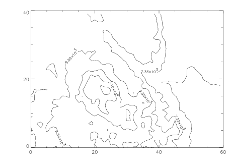
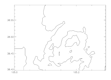
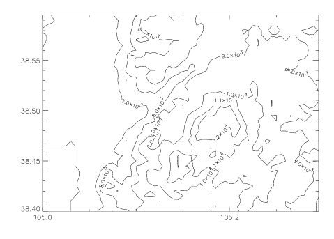
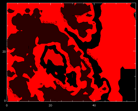
2. Create a customized CONTOURFS plot with more elevations and labels by entering:
CONTOURFS, elev, NLevels=8, /Follow
The
NLevels keyword told CONTOURFS to plot eight equally-spaced elevation levels as shown in
Figure 6-17: Contour Plot on page 107. The
Follow keyword produced the labels on the contours.
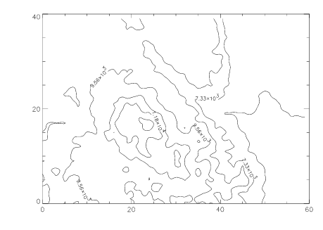
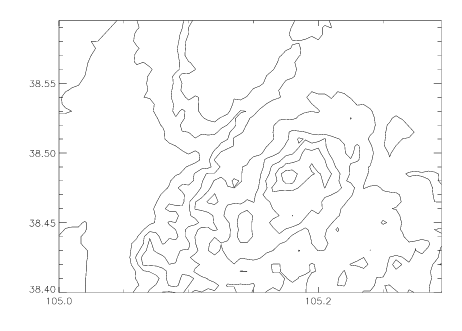
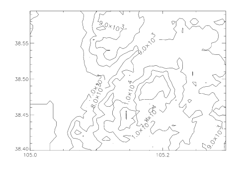
3. Smooth the contours using the Spline keyword:
CONTOURFS, elev, NLevels=8, /Spline
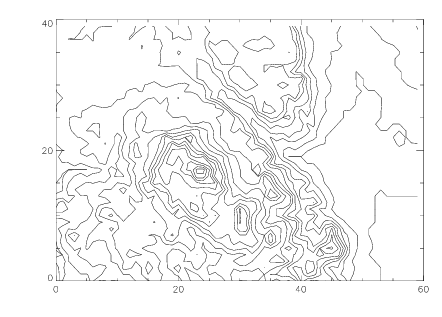
CONTOURFS, elev, NLevels=24
SURFR
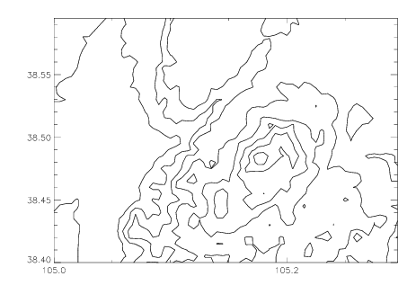
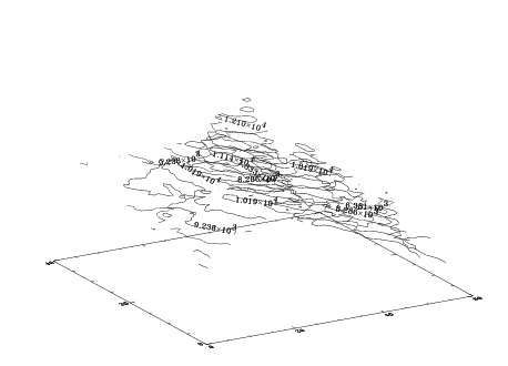
6. By using the T3D keyword in the next call to CONTOURFS, the contours will be drawn as seen from a 3D perspective. Enter:
CONTOURFS, elev, NLevels=24, /T3D
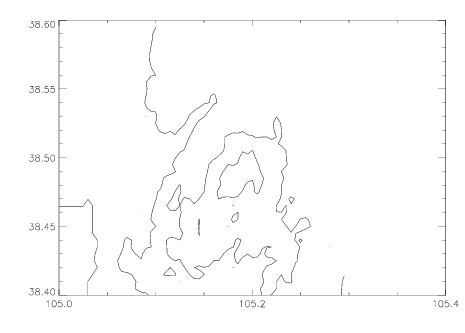
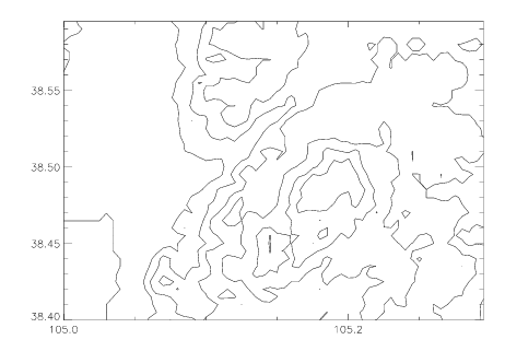
CONTOURFS, elev, lon, lat
CONTOURFS, elev, lon, lat, XStyle=1, YStyle=1
9. Add more contour levels:
CONTOURFS, elev, lon, lat, XStyle=1, YStyle=1, NLevels=10
10. Double the thickness of the contour lines using the Thick keyword:
CONTOURFS, elev, lon, lat, XStyle=1, YStyle=1, NLevels=10, $
Thick=2.0
11. Create a variable to specify the contour levels to display:
level = [5000, 6000, 7000, 8000, 9000, 10000, 11000, 12000]
CONTOURFS, elev, lon, lat, XStyle=1, YStyle=1, Levels=level
CONTOURFS, elev, lon, lat, XStyle=1, YStyle=1, $
Levels=level, C_Label=[1, 1, 1, 1, 1, 1, 1, 1]
14. Increase the size of the characters on the contour labels by 25%:
CONTOURFS, elev, lon, lat, XStyle=1, YStyle=1, $
Levels=level, C_Label=[1, 1, 1, 1, 1, 1, 1, 1], $
C_Charsize=1.25
Using Color in Contour Plots
The TEK_COLOR command loads 32 predefined, unique, highly saturated colors into the bottom 32 indices of the colortable. When the TEK_COLOR colortable is in effect, you will be able to easily differentiate the different data sets in a plot.
1. Load a colortable that specifies the first 32 distinct colors in the lower end of the colortable:
TEK_COLOR
2. Bring up the COLOR_PALETTE window. This window displays the colors in the colortable, and enables you to see the 32 colors (0-31) in the TEK_COLOR palette. The COLOR_PALETTE window is useful as a reference when you are choosing plot colors.
COLOR_PALETTE
3. Create a variable that specifies the indices for the colors of the contour levels:
color1 = [11, 10, 1, 5, 8, 19, 7, 3, 31]
note | The colortable indices specified in the array must be in the range {0...31} to take advantage of the bright colors created by the TEK_COLOR procedure. Colortable indices above 31 are not affected by the TEK_COLOR procedure, and will remain as defined by the previously loaded colortable. |
4. Now display the contour levels in colors, smooth the contours, and add titles to the x- and y-axes:
CONTOURFS, elev, lon, lat, XStyle=1, YStyle=1, $
Levels=level, C_Label=[1, 1, 1, 1, 1, 1, 1, 1], $
C_Charsize=1.25, C_Colors=color1, /Spline, $
XTitle='Longitude', YTitle='Latitude', Thick=2
The color further defines the contour lines.
Creating 3D Contour Plots
You can create a 3D contour plot of the elevation using colors for the contour lines.
1. Use the color palette in TEK_COLOR to choose the colors, then create a variable to specify the color indices for the lines:
TEK_COLOR
color2 = [17, 23, 16, 2, 3, 5, 7, 1, 4, 31, 8, 9, 10, 11, 13, $
15, 30, 19, 20, 21]
2. Use the SURFR procedure to duplicate the rotation, translation and scaling of the SURFACE procedure:
SURFR
CONTOURFS, elev, NLevels=20, C_Colors=color2, /Follow, /T3D
The lines are displayed in the specified colors.
4. Change the rotation and then re-draw the plot:
SURFR, AX=0, AZ=210
CONTOURFS, elev, NLevels=20, C_Colors=color2, /Follow, $
/T3D
Filling the Contours with Color Using CONTOURFILL
You can shade enclosed contours generated by the CONTOURFS procedure with the CONTOURFILL procedure. Basic syntax for this procedure is:
CONTOURFILL, 'filename', z, x, y
1. Use the CD command to move to a directory where you have write privileges:
CD, 'pathname'
2. Now plot the shaded areas, using the colors you specified earlier:
CONTOURFS, Path_filename='peak_elev.dat', elev, $
Col_Index=color1,/NoDrawPaths
3. Create a variable that specifies the color black:
color3 = 0
CONTOURFS, elev, XStyle=1, YStyle=1, Levels=level, $
C_Label=[1, 1, 1, 1, 1, 1, 1, 1], $
C_Charsize=1.25, C_Colors=color3, Col_Index=color1, $
Path_filename='peak_elev.dat'
The black lines clearly define the edges of the filled contours.
5. Make the lines show up better by doubling the thickness of each. Use the C_Thick keyword, which is specifically for the contour lines:
CONTOURFS, elev, XStyle=1, YStyle=1, Levels=level, $
C_Label=[1, 1, 1, 1, 1, 1, 1, 1],C_Charsize=1.25, $
C_Colors=color3, /NoErase, C_Thick=2, $
Col_Index=color1, Path_filename='peak_elev.dat'
note | In addition to the CONTOURFS procedure, you can create contour plots with the CONTOUR2 procedure. CONTOUR2 is particularly useful for plotting irregularly gridded or “scattered” data. Furthermore, CONTOUR2 includes a Fill keyword that allows you to produce filled contours without using the CONTOURFS method. For detailed information and examples of CONTOUR2, see the PV-WAVE Reference. For more information on contouring, see the PV‑WAVE User’s Guide. |
Deleting Windows
Delete the open graphics windows by entering the following command:
WDELETE, /All
All the windows close.
Version 2017.1
Copyright © 2019, Rogue Wave Software, Inc. All Rights Reserved.