Control Classes
All MFC control classes are derived from CWnd, but this base class does not provide some of the control interfaces needed by the grid object such as mouse operations, find and replace, etc. Objective Grid uses the same multiple inheritance technique to create control classes with an appropriate interface.
Controls can be combined with children. For example, a spin control has two arrow children: an up-arrow child and a down-arrow child. Objective Grid provides several control child classes, mainly to be used as small buttons in a cell.
You need to register new controls in the grid object (with
CGXGridCore::RegisterControl) before using them as cell controls. See
“Quick-Reference Guide to Built-in Functions” for more information.
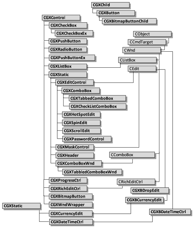
Figure 6 shows the class hierarchy for the control classes.
CGXControl
The CGXControl class is an abstract base class. CGXControl establishes a default grid-to-control interface that derived control classes must implement. By deriving from CGXControl, new controls can be implemented simply by overriding a handful of methods. New controls can also be derived from CGXControl and an existing MFC control class to implement a standard MFC control derivative. The resulting MFC control derivative derives its message map from the MFC inheritance and its grid properties from the CGXControl inheritance. For example, classes CGXEditControl, CGXComboBoxWnd and CGXListBox are MFC control derivatives that use this approach.
Developers can easily modify the behavior of the CGXControl derived classes. For example, you could create an owner-drawn combo box of colors or a drop-down calendar.
CGXBitmapButton
The CGXBitmapButton class implements a bitmap button control that can be used in grid cells.
CGXCheckBox
The CGXCheckBox class implements a check box control that can be used in grid cells. This class realizes the GX_IDS_CTRL_CHECKBOX and GX_IDS_CTRL_CHECKBOX3D control IDs.
CGXCheckBoxEx
The CGXCheckBoxEx class implements a check box control that can be used in grid cells. It also supports an active state for the check box control. This class realizes the GX_IDS_CTRL_CHECKBOX_EX and GX_IDS_CTRL_CHECKBOX3D_EX control IDs.
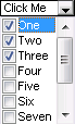
CGXCheckListComboBox
The CGXCheckListComboBox class implements a drop down list that allows the user make multiple selections. This class realizes the GX_IDS_CTRL_CHECKLIST_COMBOBOX control ID.
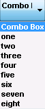
CGXComboBox
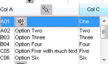
The CGXComboBox class implements a text input control that can be used to display and edit text in cells. The user can modify this text in place or select an item from a drop down list box. CGXComboBox realizes the GX_IDS_CTRL_COMBOBOX, GX_IDS_CTRL_TEXTFIT, GX_IDS_CTRL_ZEROBASED, GX_IDS_CTRL_ONEBASED, GX_IDS_CTRL_ZEROBASED_EX, and GX_IDS_CTRL_ONEBASED_EX control IDs.
CGXComboBoxWnd
The CGXComboBoxWnd class implements a combo box control that can be used to display and select items from a list. The user can select items in the combo box. The difference between CGXComboBoxWnd and CGXComboBox is that CGXComboBoxWnd is derived from the Windows standard CComboBox control, while CGXComboBox is a CGXEditControl with a small button at the right-hand side of the input area. CGXComboBoxWnd realizes the GX_IDS_CTRL_CBS_DROPDOWN and GX_IDS_CTRL_CBS_DROPDOWNLIST control IDs.
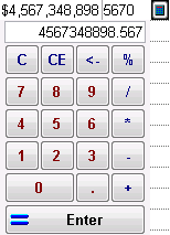
CGXCurrencyEdit
The CGXCurrencyEdit class implements a currency control cell type that can be used to display and enter currency values. CGXCurrencyEdit realizes the GX_IDS_CTRL_CURRENCY control ID.
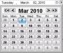
CGXDateTimeCtrl
The CGXDateTimeCtrl class implements a date control cell type that can be used to display and enter dates. CGXDateTimeCtrl realizes the GX_IDS_CTRL_DATETIME and GX_IDS_CTRL_DATETIMENOCAL control IDs.
CGXEditControl
The CGXEditControl class implements a text input control that can be used to display and edit text in cells. CGXEditControl realizes the GX_IDS_CTRL_EDIT control ID.
CGXHeader
The CGXHeader class implements a static text control which is used to display column and row headers. Headers typically have a 3d-button-look and a special feature is that they are drawn in a pressed state if the current cell is at the same row or column. CGXHeader realizes the GX_IDS_CTRL_HEADER control ID.
CGXHotSpotEdit
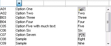
The CGXHotSpotEdit class implements a text input control that can be used to display and edit text in cells. The user can modify this text in place . The difference between CGXHotSpotEdit and CGXEditControl is that CGXHotSpotEdit displays a small button at the right side of the input area. CGXHotSpotEdit realizes the GX_IDS_CTRL_HOTSPOT control ID.
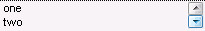
CGXListBox
The CGXListBox class implements a list box control that can be used to display and select items from a list. The user can select items in the list box. CGXListBox realizes the GX_IDS_CTRL_LISTBOX control ID.
CGXMaskControl
CGXMaskControl lets you add formatted input capabilities for cells. CGXMaskControl realizes the GX_IDS_CTRL_MASKEDIT control ID.
CGXPasswordControl
The CGXPasswordControl class implements a text input control for passwords. When the user modifies the text, a password character (e.g. an asterisk, *) will be shown for each entered character. CGXPasswordControl realizes the GX_IDS_CTRL_PASSWORD control ID.
CGXProgressCtrl
The CGXProgressCtrl class lets you display a progress bar in cells. It also lets you display text (e.g. percentage value) in the cell. CGXProgressCtrl realizes the GX_IDS_CTRL_PROGRESS control ID.
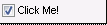
CGXPushbutton
The CGXPushbutton class implements a pushbutton control that can be used in grid cells. CGXPushButton realizes the GX_IDS_CTRL_PUSHBTN control ID.
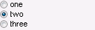
CGXRadioButton
The CGXRadioButton class implements a control with a group of radio buttons that can be used in grid cells. CGXRadioButton realizes the GX_IDS_CTRL_RADIOBTN and GX_IDS_CTRL_RADIOBTN3D control IDs.
CGXRadioButtonEx
The CGXRadioButtonEx class implements a control with a group of radio buttons that can be used in grid cells. It supports an active state for the control as well as horizontal or vertical orientation for the radio buttons. CGXRadioButtonEx realizes the GX_IDS_CTRL_RADIOBTNEX and GX_IDS_CTRL_RADIOBTN3DEX control IDs.
This control has the ability to align vertically or horizontally via the GX_IDS_UA_RADIOBUTTON_ALIGN user attribute.
NOTE >> In Objective Grid version 7.0 and earlier, text was always located to the right of the radio button. An option in more recent versions allows you to place the text to either the left or right of the radio button.
The GX_IDS_UA_RADIOBUTTONTEXTALIGN user attribute is similar to GX_IDS_UA_RADIOBUTTON_ALIGN, but indicates whether to place the text to the left or right of the button. To get the look you had in earlier versions (text on the right side), try the following code:
SetStyleRange(CGXRange(1,5),
CGXStyle()
.SetControl(GX_IDS_CTRL_RADIOBTN3DEX)
.SetChoiceList("choice one\nchoice two\nchoice three\n")
.SetUserAttribute(GX_IDS_UA_RADIOBUTTON_ALIGN, _T("1"))
//test to the right
.SetUserAttribute(GX_IDS_UA_RADIOBUTTONTEXTALIGN, _T("1"))
.SetValue("0") // select first choice
);
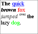
CGXRichEditCtrl
The CGXRichEditCtrl lets you display and edit Rich Text in cells. Rich Text allows you to format individual characters or paragraphs with different fonts, colors or horizontal alignment. CGXRichEditCtrl realizes the GX_IDS_CTRL_RICHEDIT control ID.
CGXSpinEdit
The CGXSpinEdit class implements a text input control with spin buttons. The user can modify this text in place, increase or decrease the value by clicking on the spin buttons. CGXSpinEdit realizes the GX_IDS_CTRL_SPINEDIT control ID.
CGXStatic
The CGXStatic class implements a static text control that can be used to display text in cells. The user cannot modify this text in place. CGXStatic realizes the GX_IDS_CTRL_STATIC control ID.
CGXTabbedComboBox
The CGXTabbedComboBox class implements a tabbed combo box based on the existing CGXComboBox implementation. CGXTabbedComboBox realizes the GX_IDS_CTRL_TABBED_COMBOBOX control ID.
CGXTabbedComboBoxWnd
The CGXTabbedComboBoxWnd class implements a tabbed combo box based on the existing CGXComboBoxWnd implementation. CGXTabbedComboBoxWnd realizes the GX_IDS_CTRL_CBS_TABBED_DROPDOWN and GX_IDS_CTRL_CBS_TABBED_DROPDOWNLIST control IDs.
CGXVScrollEdit
The CGXVScrollEdit class implements a text input control that can be used to display and edit text in cells. The user can modify this text in place. The difference between CGXVScrollEdit and CGXEditControl is that CGXVScrollEdit displays a vertical scrollbar for multiline text cells by default. CGXVScrollEdit realizes the GX_IDS_CTRL_SCROLLEDIT control ID.
CGXWndWrapper
The CGXWndWrapper class is an adapter-like class for CWnd-derived objects. You can use any CWnd-derived object as a cell in the grid when you wrap it with CGXWndWrapper.
CGXChild
The CGXChild class is an abstract base class. CGXChild establishes a default control to child interface that derived control child classes must implement. CGXChild objects can be added to a CGXControl object and can be used for small buttons (for example the up- and down-arrow button in the CGXSpinEdit control).
CGXButton
The CGXButton class implements a pushbutton that can be used as a child in a control.
CGXBitmapButtonChild
The CGXBitmapButtonChild class implements a bitmap button that can be used as a child in a control.


