Pre-Built Dialogs for Accessing Objective Grid Objects
Each section below contains a brief description of the pre-built dialogs contained in Objective Grid, a detailed breakdown of each component on the dialog, and a list of associated APIs. If you would like more information about their use, please consult the Objective Grid Class Reference. Dialog item resource IDs can obtained by opening the Objective Grid resource file gxres.rc and browsing the dialog resources.
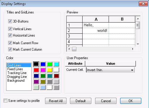
Display Settings Dialog
This pre-built dialog allows the end user to modify certain attributes of the CGXProperties object associated with the grid object at run time.
The Display Settings Dialog contains the following features:
• Titles and Grid Lines. This is a set of check boxes that allow the user to customize the column/row headers and grid lines.
Table 5 – Customizing Column/Row Headers and Grid Lines
3D-Buttons | Specifies whether the column/row headers are displayed as buttons (3D with raised and lowered effects). |
Vertical Lines | Specifies whether the vertical grid lines are displayed. |
Horizontal Lines | Specifies whether the horizontal grid lines are displayed. |
Mark Current Row | Specifies whether the current cell’s row should be marked visually in the row header. (Has no effect if 3D-Buttons is not checked.) |
Mark Current Column | Specifies whether the current cell’s column should be marked visually in the column header. (Has no effect if 3D-Buttons is not checked.) |
The following APIs are relevant for titles and grid lines:
— CGXProperties::GetDisplay3dButtons()
— CGXProperties::SetDisplay3dButtons()
— CGXProperties::GetDisplayVertLines()
— CGXProperties::SetDisplayVertLines()
— CGXProperties::GetDisplayHorzLines()
— CGXProperties::SetDisplayHorzLines()
— CGXProperties::GetMarkRowHeader()
— CGXProperties::SetMarkRowHeader()
— CGXProperties::GetMarkColHeader()
— CGXProperties::SetMarkColHeader()
• Preview. This is a preview grid that allows the user to see the changes immediately, before actually applying them to the grid.
• Color. This is a pair of controls that allow the user to customize the grid's colors. On the left is a list box containing several color properties and on the right is a color box containing color choices.
Table 6 – Customizing the Grid’s Colors
Grid Lines | Specifies the grid lines’ color. |
Fixed Lines | Specifies the color of the line that separates frozen columns/rows and non-frozen columns/rows. |
Tracking Line | Specifies the color of the outline when columns/rows are being resized. |
Dragging Line | Specifies the color of the line where a dragged column/row will be dropped. |
Background | Specifies the color used to draw the “gray area” outside of the grid. |
New color properties may be added using CGXProperties::AddColorProperty().
Use the following APIs for color:
— CGXProperties::GetColor()
— CGXProperties::SetColor()
— CGXProperties::AddColorProperty()
• User Properties. This is a grid control that allows the user to change user properties.
New user properties may be added using CGXProperties::AddUserProperty().
Use the following APIs for User Properties:
— CGXProperties::GetUserProperty()
— CGXProperties::SetUserProperty()
— CGXProperties::AddUserProperty()
• Settings to Profile. This is a check box that allows the user to save the current dialog settings as the default values.
When the user has checked this check box, a boolean variable, whose address was passed during dialog class construction, will be set to TRUE. The developer should check this variable to determine if the profile should be saved.
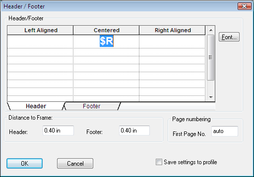
Header / Footer Dialog
This pre-built dialog allows the end user to specify page header and page footer text.
• Header / Footer. This is a tabbed grid control that contains 3 columns and 10 rows on each of 2 tabs. Its purpose is to provide an interface for entering page header and page footer text.
The column headers, labeled Left Aligned, Centered, and Right Aligned, indicate the header alignment of the text in the cells below them. All of the text contained in the Left Aligned column (with the exception of the column header) will be left justified in the header/footer. The Centered column will be centered horizontally and Right Aligned will be right justified.
There are 10 rows used for entering header/footer text, providing the user with a mechanism to mix fonts within the header/footer. The actual text printed to the page is pieced together by appending each of the cells to the previous. In other words, the Left Aligned header text is determined as follows: (1,1) + (2,1) + (3,1) + (4,1) + (5,1) + (6,1) + (7,1) + (8,1) + (9,1) + (10,1), where (x,y) indicates the text contained in that cell and + indicates string concatenation.
The font can be changed by selecting a cell or range of cells, and then clicking the font button. A standard font dialog will be displayed and the user can make the necessary changes. When the font dialog is closed via its OK button, the changes will be applied back to the selected cells.
In addition to text, the grid will also accept the following predefined tokens (or escape sequences):
— $F – Document file name
— $A – Application name
— $P – Current page number
— $N – Total number of pages
— $D – Current date (See GetDataHeader() in the Objective Grid Class Reference for additional date formatting information.)
— $R – Register / Tabsheet name (if grid is used in a workbook)
Existing tokens may be modified or new tokens may be defined using the following CGXProperties methods: AddToken(), SubstTokenText(), and GetTokenArgs().
Use the following APIs for Header / Footer:
— CGXProperties::GetDataHeader()
— CGXProperties::GetDataFooter()
— CGXProperties::AddToken()
— CGXProperties::SubstTokenText()
— CGXProperties::GetTokenArgs()
— CGXGridCore::OnPrintHeaderAndFooter()
• Distance to Frame. This is a set of edit controls that specify the vertical space between the header/footer and the top/bottom margin. The value may be entered as inches or centimeters by appending in or cm to the end of the value. The default, if no units are entered or the unit is not recognized, is inches.
Use the following APIs for Distance to Frame:
— CGXProperties::GetDistances()
— CGXProperties::SetDistances()
• Page Numbering. This is an edit control that allows the user to specify the starting page number. All subsequent pages are numbered according to this value.
Use the following APIs for Page Numbering:
— CGXProperties::GetFirstPage()
— CGXProperties::SetFirstPage()
• Save Settings to Profile. This is a check box that allows the user to save the current dialog settings as the default values.
The check box’s resource ID is GX_IDC_PCHECK_SAVEDEFAULT.
When the user has checked this check box, a boolean variable, whose address was passed during dialog class construction, will be set to TRUE. The developer should check this variable to determine if the profile should be saved.
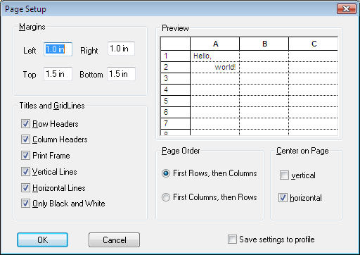
Page Setup Dialog
This pre-built dialog allows the end user to specify printing specific settings for Objective Grid.
See
Table 7 for a description of the features in the Page Setup dialog.
Table 7 – Page setup dialog
Component | Description | Relevant APIs |
Margins | Editing controls used to specify the print margins. | CGXProperties::GetMargins() CGXProperties::SetMargins() |
Preview | Preview grid that allows the user to see the changes in real time, before applying them back to the grid. | N/A |
Titles and Grid Lines | Check boxes that allow the user to customize the column/row headers and gridlinesRow Headers. Specifies if row headers should be printed.Column Headers. Specifies if column headers should be printed.Print Frame. Specifies if a frame should be drawn around the grid when printed.Vertical Lines. Specifies if vertical grid lines should be printed.Horizontal Lines. Specifies if horizontal grid lines should be printed.Only Black and White. Specifies if the grid should be printed only with black and white colors. | CGXProperties::GetPrintRowHeaders() CGXProperties::SetPrintRowHeaders() CGXProperties::GetPrintColHeaders() CGXProperties::SetPrintColHeaders() CGXProperties::GetPrintFrame() CGXProperties::SetPrintFrame() CGXProperties::GetPrintVertLines() CGXProperties::SetPrintVertLines() CGXProperties::GetPrintHorzLines() CGXProperties::SetPrintHorzLines() CGXProperties::GetPrintBlackWhite() CGXProperties::SetBlackWhite() |
Page Order | Radio buttons used to specify the page order when printing a grid across multiple pages. | CGXProperties::GetPageOrder() CGXProperties::SetPageOrder() |
Center on Page | Check boxes used to specify vertical and horizontal centering when printing a grid. | CGXProperties::GetCenterVertical() CGXProperties::SetCenterVertical() CGXProperties::GetCenterHorizontal() CGXProperties::SetCenterHorizontal() |
Save Settings to Profile | Check box that allows the user to save the current dialog settings as the default values. When the user has checked this check box, a boolean variable, whose address was passed during dialog class construction, will be set to TRUE. The developer should check this variable to determine if the profile should be saved. | N/A |