Using the Objective Views AppWizard
When you install Objective Views, the Objective Views AppWizard is added to the Visual Studio environment. The AppWizard asks the user a series of questions and generates a working application that uses the Objective Views library. Except for the addition of two steps specific to Objective Views, it is identical to the MFC AppWizard. Using the Objective Views AppWizard, you can quickly create applications that serve as a starting point for your projects.
Starting the Objective Views AppWizard
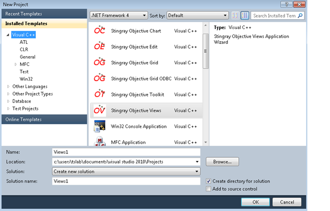
1. Open Visual Studio IDE. Select the File|New|Project menu command.
2. Select Visual C++ | MFC projects from the Installed Templates.
3. Select Stingray Objective Views Application Wizard from the list of available project types.
If Stingray Objective Views Application Wizard does not appear in the project type list, the AppWizard is not properly installed. Please contact Rogue Wave Technical Support for additional information.
Selecting Options in the Objective Views AppWizard
The AppWizard consists of a series of pages. Each page consists of options that you can select for your application. Navigate between steps using the links in the left frame of the dialog. On the first page of the AppWizard, you can click the Finish button to select the defaults for the remaining steps and generate the application.
The Objective Views AppWizard is based on the Visual Studio MFC AppWizard, and the steps are identical. See the Microsoft Visual Studio documentation to learn more about the MFC AppWizard.
Instead of MFC Feature Pack framework classes, the Objective Views AppWizard uses classes from Stingray Studio library FoundationEx. For example, in an MDI application it uses SFLWinAppEx instead of CWinAppEx, SFLMDIFrameWndEx instead of CMDIFrameWndEx, and SFLMDIChildWndEx instead of CMDIChildWndEx. Also, the AppWizard adds classes derived from Objective Views-specific ones: CODModel, CODViewport, CODController.
Toolbar Commands in Visual Studio
The Objective Views AppWizard adds the following FoundationEx bars instead of the MFC Feature Pack ones:
SFLMenuBarEx m_wndMenuBar; // Replaces CMFCMenuBar m_wndMenuBar
SFLToolBarEx m_wndToolBar; // Replaces CMFCToolBar m_wndToolBar
SFLToolBarEx m_wndSymbolBar; // Objective Views CMFCToolBar
SFLStatusBarEx m_wndStatusBar; // Replaces CMFCStatusBar m_wndStatusBar
These bars are created with specific code inside the CMainFrame::OnCreate() method. For example:
if (!m_wndSymbolBar.CreateEx(this, TBSTYLE_FLAT, WS_CHILD | WS_VISIBLE
| CBRS_TOP | CBRS_GRIPPER | CBRS_TOOLTIPS | CBRS_FLYBY | CBRS_SIZE_DYNAMIC)
|| !m_wndSymbolBar.LoadToolBar(theApp.m_bHiColorIcons ? IDR_SYMBOLS : IDR_SYMBOLS))
{
TRACE0("Failed to create symbols toolbar\n");
return -1; // failed to create
}
To create other Objective Views toolbars, simply replace IDR_SYMBOLS with the corresponding resource name, and create another SFLToolBarEx member variable.
A full list of Objective Views toolbar creation methods can be found in the <stingray-installdir>\Samples\Views\Showcase sample, or the <stingray-installdir>\Samples\FoundationEx\ShowcaseEx sample. Look inside the CMainFrame::OnCreate() method.
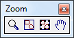
Zoom/Pan
The Zoom/Pan toolbar contains commands for zooming and panning the canvas.
• Zoom. Changes cursor to a magnifying glass and allows the user to click the left and right mouse buttons to zoom in and out.
• Zoom to Fit. Sets the magnification level of the canvas so that all components on the canvas are visible in the viewport.
• Zoom to Selection. Sets the magnification level of the canvas so that the selected components are visible in the viewport.
• Pan. Changes the pointer to a hand and allows the user to grab the canvas with the left mouse button and pan in any direction.
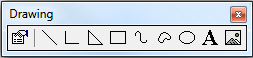
Drawing
The Drawing toolbar contains commands for basic shapes on the canvas.
• Select. Changes the cursor to an arrow and puts the canvas in select mode.
• Edit Vertices. Puts the canvas in a mode that allows the user to move the vertices of the currently selected component. Depending on the type of component, the user may also be allowed to add and delete vertices.
• Properties. Opens the property editor for the currently selected components.
• Line. Sets the canvas to line drawing mode. Changes the cursor to a cross and allows the user to create a line by clicking the left mouse button, dragging the mouse, and then releasing the left mouse button.
• Polyline. Sets the canvas to polyline drawing mode. Changes the cursor to a cross and allows the user to draw a component composed of multiple line segments.
• Polygon. Sets the canvas to polygon drawing mode. Changes the cursor to a cross and allows the user to draw a polygon component on the canvas using the mouse.
• Rectangle. Sets the canvas to rectangle drawing mode. Changes the cursor to a cross and allows the user to draw a rectangle component on the canvas.
• Polycurve. Sets the canvas to polycurve drawing mode. Changes the cursor to a cross and allows the user to draw a shape composed of Bezier curves.
• Closed curve. Sets the canvas to closed curve drawing mode. Identical to the Polycurve command, except that the endpoints of the resulting component are connected.
• Ellipse. Sets the canvas to ellipse drawing mode. Changes the cursor to a cross and allows the user to draw an ellipse on the canvas by outlining a bounding box using the mouse.
• Text. Allows the user to add a text component to the canvas.
• Image. Allows the user to add an image component to the canvas.
• Port. Allows the user to add a circle port component to the canvas.
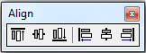
Alignment
Contains commands for aligning components with respect to a given anchor component. The anchor component is always the last component selected and is differentiated from the other selected components by gray selection handles.
• Align Top. Horizontally aligns the selected components with the top of the anchor component.
• Align Middle. Horizontally aligns the selected components with the center of the anchor component.
• Align Bottom. Horizontally aligns the selected components with the bottom of the anchor component.
• Align Left. Vertically aligns the selected components with the left edge of the anchor component.
• Align Center. Vertically aligns the selected components with the center of the anchor component.
• Align Right. Vertically aligns the selected components with the right edge of the anchor component.
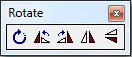
Rotate
Contains commands for rotating the selected components.
• Rotate. Sets the canvas to rotate mode. Changes the cursor to a circular arrow when it is over a component. Allows the user to grab a component and rotate it with the mouse.
• Rotate Left. Rotates the selected components by 90 degrees to the left.
• Rotate Right. Rotates the selected components by 90 degrees to the right.
• Flip Vertical. Flips the selected components 180 degrees about the Y axis.
• Flip Horizontal. Flips the selected components 180 degrees about the X axis.
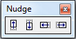
Nudge
Contains commands for moving the selected components by one logical unit in any direction.
• Nudge Up. Move the selected components one logical unit up.
• Nudge Down. Move the selected components one logical unit down.
• Nudge Left. Move the selected components one logical unit left.
• Nudge Right. Move the selected components one logical unit right.
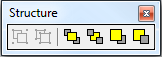
Structure
Contains commands for grouping components together and changing the Z-order (stacking order of layers) of components on the canvas.
• Group
• Ungroup
• Front
• Back
• Forward
• Backward
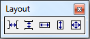
Layout
Contains commands for arranging components with respect to each other. The spacing commands take three or more components and evenly space them between the minimum and maximum points in the range selected. The size commands adjust the size of the selected components to match the anchor component.
• Space Across. Space the selected components evenly between the left-most and right-most components selected.
• Space Down. Space the selected components evenly between the top-most and bottom-most components selected.
• Same Width. Change the width of the selected components to match the anchor component.
• Same Height. Change the height of the selected components to match the anchor component.
• Same Size. Change the width and height of the selected components to match the size of the anchor component.
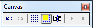
Canvas
Contains commands that change the appearance and behavior of the canvas.
• Undo. Undo the last command executed on the canvas.
• Redo. Redo the last undo that was performed.
• Toggle Grid. Turn display of the grid on and off.
• Snap to Grid. Toggle the snap-to-grid feature on and off.
• Toggle Page Bounds. Turn display of page boundaries on and off.
This step also contains a checkbox group called Canvas Options. These options affect the appearance and behavior of the canvas. The two options in this group allow the user to add ruler guides to the canvas. The user can add a horizontal ruler, a vertical ruler, or both.
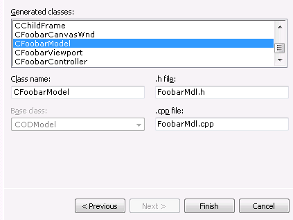
Generating the Application
The last page in the Objective Views AppWizard looks like
Figure 13.
This page displays the names of classes and files generated by the Objective Views AppWizard. The Class Name, Header File, and Implementation File fields on this dialog display information regarding the currently selected class in the list box. The user can change the class name, header file, or implementation file by editing these fields.
When you click the Finish button, the Objective Views AppWizard creates the files for your new project and loads it into Visual Studio.
You can add _OVDLL in Preprocessor Definitions if you want to link dynamically to Objective Views library. The AppWizard creates the project for Win32 builds only. You can add x64 build configurations if you need to.
For Visual Studio 2010 or later, please refer to
“Stingray Studio Paths in Property Sheets” in the
Getting Started part for information on how to add property sheet(s) with Stingray Studio paths to the project.
At this point, the application is ready to build and run. Make sure that the Objective Views libraries have been built prior to building and running your new project.