Customizing a Plot
The core of PV-WAVE is visualization. Because of this, the look and feel of plots is highly customizable.
This section demonstrates some of the following concepts when modifying the plot’s look and feel:
Using Keyword Parameters
The plotting procedures are designed to produce acceptable results for most applications with a minimum amount of effort. The plotting and graphics keyword parameters and system variables, which are described in the PV‑WAVE Reference, allow you to customize your graphics output. Examples in this chapter show how to use many of the major keywords and system variables used to modify 2D graphics.
Adding Titles
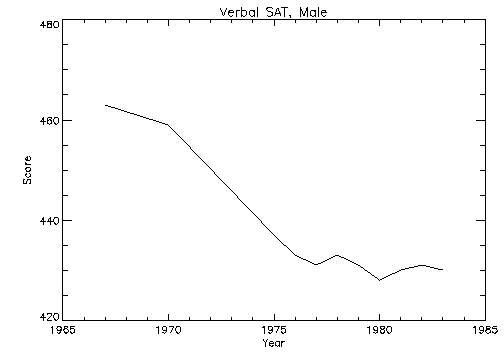
The
Title,
XTitle, and
YTitle keywords are used to produce axis titles and a main title in the plot shown in
Plot with Title Annotation. This figure was produced with the statement:
PLOT, YEAR, VERBM, /YNozero, Title='Verbal SAT, Male', $
XTitle='Year', YTitle='Score'
Annotating Plots
An obvious problem with overplotting is that it lacks labels describing the different lines shown. To annotate a plot, select an appropriate font and then use the XYOUTS procedure.
Selecting Fonts
You can use software or hardware generated fonts to annotate plots. The PV‑WAVE User’s Guide explains the difference between these types of fonts and the advantages and disadvantages of each.
The annotation in
Figure 5-6: Annotation Example on page 58 uses the PostScript Helvetica font. This is selected by first setting the default font, !P.Font, to the hardware font index of 0, and then calling the DEVICE procedure to set the Helvetica font:
!P.Font = 0
SET_PLOT, 'ps'
DEVICE, /Helvetica
Other PostScript fonts and their bold, italic, oblique and other variants are described in the PV‑WAVE Reference.
Using XYOUTS to Annotate Plots
You can add labels and other annotation to your plots with the XYOUTS procedure. The XYOUTS procedure is used to write graphic text at a given location (X, Y):
XYOUTS, x, y, 'string'
For a description of XYOUTS and its keywords, see the PV‑WAVE Reference.
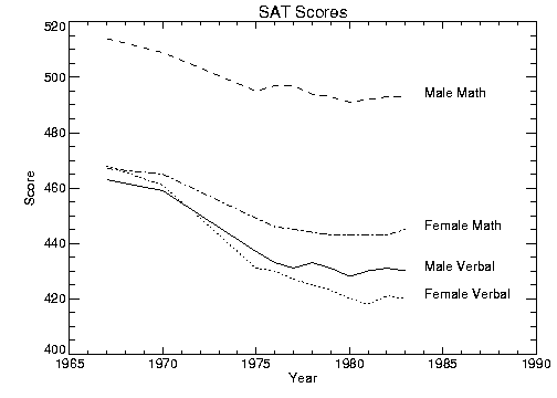
Figure 5-6: Annotation Example on page 58 illustrates one method of annotating each graph with its name. The plot is produced in the same manner as was
Figure 5-15: Overplot on page 75, with the exception that the
x‑axis range is extended to the year 1990 to allow room for the titles. To accomplish this, the keyword parameter
XRange = [1967, 1990] is added to the call to PLOT. A string vector,
NAMES, containing the names of each score is also defined. As noted in the previous section, the PostScript Helvetica font was selected for this example.
The annotation in
Figure 5-6: Annotation Example on page 58 is produced using the statements:
; Vector containing the name of each score.
VERBM = [463, 459, 437, 433, 431, 433, 431, 428, 430, 431, 430]
VERBF = [468, 461, 431, 430, 427, 425, 423, 420, 418, 421, 420]
MATHM = [514, 509, 495, 497, 497, 494, 493, 491, 492, 493, 493]
MATHF = [467, 465, 449, 446, 445, 444, 443, 443, 443, 443, 445]
YEAR = [1967, 1970, INDGEN(9) + 1975, 1990]
allpts = [[verbf], [verbm], [mathf], [mathm]]
names = ['Female Verbal', 'Male Verbal', 'Female Math', $
'Male Math']
PLOT, YEAR, VERBF, YRange=[MIN(allpts), MAX(allpts) + 5], $
/YNozero, Title = 'SAT Scores', XTitle = 'Year', $
YTitle = 'Score'
FOR i=1, 3 do OPLOT, year, allpts(*, i), Line = i
FOR i=0,3 do XYOUTS, 1984, allpts(N_ELEMENTS(year) -2, i), $
names(i)
Using Different Marker Symbols
Each data point may be marked with a symbol and/or connected with lines. The value of the keyword parameter Psym selects the marker symbol. Psym is described in detail in the PV‑WAVE Reference.
For example, a value of 1 marks each data point with the plus sign, 2 is an asterisk, etc. Setting Psym to a negative symbol number marks the points with a symbol and connects them with lines. For example, a value of –1 marks points with a plus sign and connects them with lines.
Note also that setting Psym to a value of 10 produces histogram-style plots, as described in a previous section.
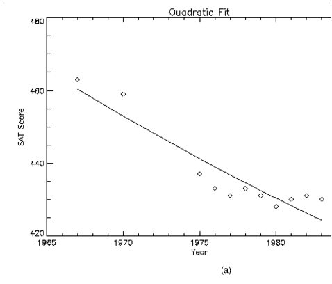
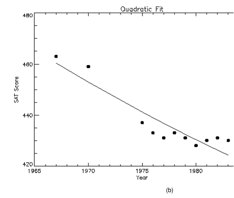
Frequently, when data points are plotted against the results of a fit or model, symbols are used to mark the data points while the model is plotted using a line.
Plotting with Symbols illustrates this, fitting the male verbal scores to a quadratic function of the year. The predefined symbols are shown in the first plot and the user-defined symbols are shown in the second plot. The POLY_FIT function is used to calculate the quadratic. The statements used to construct this plot are:
; Use the POLY_FIT function to obtain a quadratic fit.
COEFF = poly_fit(YEAR(0:N_ELEMENTS(YEAR) -2), VERBM, 2, YFIT)
; Create a user-defined plot symbol (A STAR)
XSYM = [0, 0.25, 0, 0.33, 0.5, 0.66, 1, 0.75, 1, 0.5, 0]
YSYM = [0, 0.33, 0.66, 0.75, 1, 0.75, 0.66, 0.33, 0, 0.25, 0]
USERSYM, XSYM, YSYM, /FILL
!P.MULTI = [0,2,1]
; Plot the dataset with the user defined symbol
PLOT, YEAR, VERBM, PSYM = 8, SYMSIZE = 3,/YNozero, $
Title = 'Quadratic Fit', XTitle = 'Year', YTitle = 'Score'
; Plot the quadratic approximation
OPLOT, YEAR, YFIT
; Plot the dataset with the pre-defined symbol
PLOT, YEAR, VERBM, PSYM = 4, SYMSIZE = 3,/YNozero, $
Title = 'Quadratic Fit', XTitle = 'Year', YTitle = 'Score'
; Plot the quadratic approximation
OPLOT, YEAR, YFIT
Using Patterns to Highlight Plots
Many scientific graphs use region filling to highlight the difference between two or more curves (i.e., to illustrate boundaries, etc.). Given a list of vertices, the procedure POLYFILL fills the interior of an arbitrary polygon.
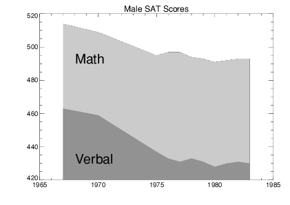
Using POLYFILL illustrates a simple example of polygon filling by filling the region under the male math scores with a color index of 75% the maximum, and then filling the region under the male verbal scores with a 50% of maximum index. Because the male math scores are always higher than the verbal, the graph appears as two distinct regions.
The following discussion describes the program that produced
Using POLYFILL. First, a plot axis is drawn with no data, using the
Nodata keyword. The minimum and maximum
y–values are directly specified with the
YRange keyword. Because the
y–axis range does not always exactly include the specified interval (see
"Scaling Plot Axes"), the variable
MINVAL, is set to the current
y‑axis minimum, !Y.Crange(0). Next, the upper math score region is shaded with a polygon containing the vertices of the math scores, preceded and followed by points on the
x–axis, (
YEAR(0), MINVAL), and (
YEAR(n – 1), MINVAL).
The polygon for the verbal scores is drawn using the same method with a different color. Finally, the XYOUTS procedure is used to annotate the two regions.
; Use hardware fonts.
!P.Font = 0
; Set font to Helvetica.
DEVICE, /Helvetica
; Draw axes, no data, set the range.
PLOT, year, mathm, YRange=[MIN(verbm), $
MAX(mathm)], /Nodata, Title='Male SAT Scores'
; Make vector of x–values for the polygon by duplicating the first
; and last points.
pxval = [year(0), year, year(N_ELEMENTS(year) - 1)]
; Get y–value along bottom x–axis.
minval = !Y.Crange(0)
; Make a polygon by extending the edges of the math score
; down to the x–axis.
POLYFILL, pxval, [minval, mathm, minval], COL=0.75 * !D.N_Colors
; Same with verbal.
POLYFILL, pxval, [minval, verbm, minval], COL=0.50 * !D.N_Colors
; Label the polygons.
XYOUTS, 1968, 430, 'Verbal', Size=2
XYOUTS, 1968, 490, 'Math', Size=2
Keyword Correspondence with System Variables
Many of the plotting keyword parameters correspond directly to fields in the system variables !P, !X, !Y, !Z, or !PDT. When you specify a keyword parameter name and value in a call, that value affects only the current call — the corresponding system variable field is not changed. Changing the value of a system variable field changes the default for that particular parameter and remains in effect until explicitly changed. The system variables and the corresponding keywords that are used to modify graphics are described in the PV‑WAVE Reference.
Example of Changing the Default Color Index
The color index controls the color of text, lines, axes, and data in 2D plots. By default, the color index is set in the !P.Color field of the !P system variable. This default value is normally set to the number of available colors minus 1.
Using the Color Keyword Parameter
You can override this default value at any time by including the Color keyword in the graphics routine call. For example, to set the color of a plot to color index 12, enter:
PLOT, X, Y, Color=WoColorConvert(12)
Because keyword parameters only modify the current function or procedure call, future plots are not affected.
Changing the !P.Color System Variable
To change the color for all plots produced during the current session, modify !P.Color. For example, to change the default color index to 12, enter:
!P.Color = 12
Interpretation of the Color Index
The interpretation of the color index varies among the devices supported by PV‑WAVE. With color video displays, this index selects a color (normally an RGB triple) stored in a device table. You can control the color selected by each color index with the TVLCT procedure which loads the device colortables. TVLCT is described in the PV‑WAVE Reference.
Other devices have a fixed color associated with each color index. With plotters, for example, the correspondence between colors and color index is established by the order of the pens in the carousel.
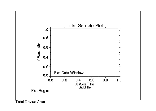
Specifying Location of the Plot
The
plot data window is the region of the page or screen enclosed by the axes. The
plot region is the box enclosing the plot data window and the titles and tick annotation.
Figure 5-9: Plot Locations on page 65 illustrates the relationship of the plot data window, plot region, and the entire device area (or window if using a windowing device).
These areas are determined by the following system variables and keyword parameters, in order of decreasing precedence. Each of these keywords and system variables are described in the PV‑WAVE Reference.
 Position
 keyword
!P.Position system variable
!P.Region system variable
!P.Multi system variable
XMargin,
YMargin, and
ZMargin keywords
!X.Margin, !Y.Margin, and !Z.Margin system variables
Drawing Multiple Plots on a Page
Plots may be grouped on the display or page in the horizontal and/or vertical directions using the !P.Multi system variable field. PV‑WAVE sets the plot window to produce the given number of plots on each page and moves the window to a new sector at the beginning of each plot. If the page is full, it is first erased. If more than two rows or columns of plots are produced, PV‑WAVE decreases the character size by a factor of 2.
!P.Multi controls the output of multiple plots and is an integer vector in which:
!P.Multi(0)—The number of empty sectors remaining on the page. The display is erased if this field is 0 when a new plot is begun.
!P.Multi(1)—The number of plots across the page.
!P.Multi(2)—The number of plots per page in the vertical direction.
For example, to stack two plots vertically on each page specify the following value for !P.Multi.
!P.Multi = [0,1,2]
Note that the first element, !P.Multi(0), is set to zero to cause the next plot to begin a new page. To make four plots per page, with two columns and two rows:
!P.Multi = [0,2,2]
Multiple Plots illustrates the two rows and two columns format. Use the following command to reset the display to the default setting of one plot per page.
!P.Multi = 0
Version 2017.1
Copyright © 2019, Rogue Wave Software, Inc. All Rights Reserved.