PLOT Procedures
Produce a 2D graph of vector parameters:

PLOT produces a simple XY plot.
PLOT_IO produces an XY plot with logarithmic scaling on the
y-axis.
PLOT_OI produces an XY plot with logarithmic scaling on the
x-axis.
PLOT_OO produces an XY plot with logarithmic scaling on both the
x- and
y-axes.
Usage
PLOT, x[, y]
PLOT_IO, x[, y]
PLOT_OI, x[, y]
PLOT_OO, x[, y]
Input Parameters
x — A vector. If only one parameter is supplied, x is plotted on the y-axis as a function of point number.
y — (optional) A vector. If two parameters are supplied, y is plotted as a function of x.
note | When plotting, invalid data values such as INF, –INF, NaN, and their Windows equivalents are ignored. The plot lines are discontiguous at invalid points. |
Keywords
Keywords let you control many aspects of a plot’s appearance. Valid keywords for the four PLOT procedures are listed below. For a description of each keyword, see
Graphics and Plotting Keywords.
PLOT Example 1
This example shows the most common way to use the PLOT procedure.
; Create a sine wave from 0 to 360 degrees.
x = FINDGEN(37) * 10
y = SIN(x * !Dtor)
; Plot the sine wave using default values for plotting keywords.
PLOT, y
WAIT, 1
; Plot the sine wave against the x values, change the range of
; the x-axis, and add labels. Notice that PV-WAVE rounds the
; requested range values on the axis to values that give a nice
; looking plot, in this case 0 to 400.
PLOT, x, y, XRange=[0, 360], Title='SIN(X)',$
XTitle='degrees', YTitle='sin(x)'
WAIT, 1
; Use keywords to get the desired style and to add fonts to
; the labels.
PLOT, x, y, XRange=[0, 360], XStyle=1, XTicks=6, $
XMinor=6, XTitle='!8degrees', YTitle='!8sin(x)!3', $
Title='!17SIN(X)'
WAIT, 1
; Plot a base line at 0.
PLOTS, [0, 360], [0, 0]
; Set up a predefined color table called tek_color.
TEK_COLOR
WAIT, 1
; Fill under the positive half of the curve with solid magenta.
POLYFILL, x(0:18), y(0:18), Color=WoColorConvert(6)
WAIT, 1
; Calculate the cosine of x.
z = COS(x * !Dtor)
; Plot cosine using a thick, dashed line and a different color.
OPLOT, x, z, Linestyle=2, Color=WoColorConvert(3), Thick=4
PLOT_OO Example
This example creates a logarithmic plot.
; Create the data.
x = [100, 5000, 20000, 50000, 70000L]
y = [100, 10000, 1100000L, 100000L, 200000L]
; Plot the data on a log-log plot, with dotted grid lines.
; Use a format of I7 for the plot labels.
PLOT_OO, x, y, Ticklen=0.5, Gridstyle=1, $
Tickformat='(I7)', Title='TEST PLOT', $
YRange=[1.e2, 1.e7], YStyle=1
; Get the maximum value of y.
max_y = MAX(y)
; Get the value for x when y is at its maximum.
x_max_y = x(WHERE(y EQ max_y))
; Print Test Max centered at the maximum point.
XYOUTS, x_max_y(0), max_y+1.e5, 'Test Max', Alignment=0.5
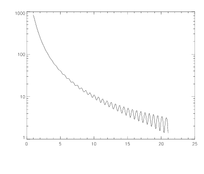
PLOT_IO Example
In this example, the cubic spline interpolant to the function
f(x) = 1000sin(1/x2) + cos(10x)
over the interval [1, 21] is plotted using PLOT_IO. This example uses the PV-WAVE IMSL Mathematics function CSINTERP. The results are shown in
Plot of Cubic Spline Interpolant Function using PLOT_IO.
; Generate the abscissas.
x = FINDGEN(101)/5 + 1
; Generate the function values.
y = 1000 * SIN(1/x^2) + COS(10 * x)
; Initialize the IMSL Mathematics Toolkit
math_init
; Compute the cubic spline interpolant.
pp = CSINTERP(x, y)
; Compute the spline values.
ppval = SPVALUE(FINDGEN(1001)/50 + 1, pp)
; Plot the result with logarithmic scaling on the y-axis.
PLOT_IO, FINDGEN(1001)/50 + 1, ppval
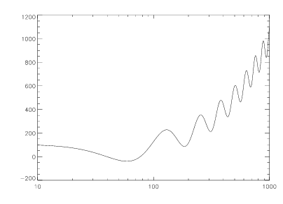
PLOT_OI Example
This example uses the PV-WAVE IMSL Mathematics SPVALUE function. The results are shown in
Figure 13-4: Semi-logarithmic Scaling of f(x) using PLOT_OI on page 915.
; Generate the abscissas and function values.
x = FINDGEN(100) * 10
y = x + 100 * COS(0.05 * x)
; Initialize the IMSL Mathematics Toolkit
math_init
; Compute the cubic spline interpolant.
pp = CSINTERP(x, y)
; Compute the spline values.
ppval = SPVALUE(FINDGEN(1000), pp)
; Plot the result with logarithmic scaling on the x-axis.
PLOT_OI, FINDGEN(1000), ppval, XRange=[10, 1000]
PLOT Example 2
This example creates a polar plot.
; Create the data.
theta = (FINDGEN(200)/100) * !Pi
r = 2 * SIN(4 * theta)
; Display a polar plot, disabling the box-style axes.
PLOT, r, theta, /Polar, XStyle=4, YStyle=4, $
Title='POLAR PLOT TEST'
; Draw an x-axis at the point 0, 0 with tick marks going down.
AXIS, 0, 0, XAxis=0
; Draw a y-axis at the point 0, 0 with tick marks going left.
AXIS, 0, 0, YAxis=0
PLOT Example 3
This example creates a plot with multiple axes.
temperature = [50., 40., 35., 60., 40.]
pressure = [1025, 1020, 1015, 1026, 1022]
TEK_COLOR
; Plot temperature against scale on the left axis.
PLOT, temperature, YRange=[20., 70], $
YTitle='Degrees Fahrenheit', XTitle='Sample Number', $
Title='Sample Data', XMargin=[8, 8], YStyle=8, $
Color=WoColorConvert(16)
; Create the axis for air pressure.
AXIS, YAxis=1, YRange=[1000, 1040], YStyle=1, $
YTitle='Air Pressure', /Save, Color=WoColorConvert(6)
; Plot air pressure against scale on the right axis.
OPLOT, pressure, Linestyle=2, Color=WoColorConvert(6)
; Display a legend.
LEGEND, ['Temperature', 'Air Pressure'], $
WoColorConvert([16, 6]), [0, 2], [0, 0], 2.4, 1005, 2
PLOT Example 4
This example creates a plot with a Date/Time x-axis.
; Create a date-time array with the first day of 2002.
x = VAR_TO_DT(2002,1,1)
; Create an array of date lines with one value for each month.
x = DTGEN(x, 12, /Month)
; Create an array of data values ranging from 0 to 1000.
y = RANDOMU(seed, 12) * 1000
; Print the current names for months, and then save them.
PRINT, !Month_Names
hold_month_names = !Month_Names
; Change the names to be 3-letter abbreviations for the months.
FOR i=0L, 11 DO !Month_Names(i) = STRMID(!Month_Names(i), 0, 3)
; Create labels on the y-axis that start with a '$'.
ylabels = STRARR(6)
FOR i=0L, 5 DO ylabels(i) = '$' + STRTRIM(string(100L * i * 2), 2)
; Plot the data and restore !Month_names to the original.
PLOT, x, y, /Month_Abbr, /Box, Title='Test Date Plot', $
YRange=[0, 1000], YStyle=1, YTickname=ylabels, YTicks=5,$
YTitle='In thousands', YGridstyle=1, YTicklen=0.5
!Month_Names = hold_month_names
Plot Example 5
This example creates a filled histogram plot.
; Create some data
TEK_COLOR
n = 9
x = RANDOMU(s,n)*100
y = RANDOMU(s,n)*100
i = SORT(x)
x = x(i)
y = y(i)
; Establish the coordinate system
PLOT, x, y, Thick=2, Psym=10, Xstyle=1, /Nodata
; Calculate the additional x-values
xnew = (x(0:n-2) + x(1:n-1)) / 2.0D
; Create array containing all x-values
xx = REBIN(xnew, N_ELEMENTS(xnew)*2, /sample)
xx = [!X.Crange(0), !X.Crange(0), xx, !X.Crange(1), $
!X.Crange(1)]
; Create array with the corresponding y-values
yy = REBIN(y, N_ELEMENTS(y)*2, /Sample)
yy = [0, yy, 0]
; Fill the histogram plot
POLYFILL, xx, yy, Psym=2, Color=WoColorConvert(24)
; Histogram plot
PLOT, x, y, Thick=2, Psym=10, Xstyle=1, /Noerase
See Also
For background information, see the PV‑WAVE User’s Guide.
Version 2017.1
Copyright © 2019, Rogue Wave Software, Inc. All Rights Reserved.